Building Your Email List: 8 Onsite Strategies to Supercharge Subscriber Growth
February 25, 2019 | Sean Foo

Email has always been one of the most effective methods of reaching prospects.
While it might not be as new and novel as social media, email maintains one of the highest ROIs of any marketing channel – particularly when used in tandem with other strategies.
In fact, the rate at which email prompts purchases is approximately 17% higher than the rate of social media.
Email:
– Is the number one digital channel for ROI according to 73% of marketers.
– Will have over 3 billion users by 2020.
– Is the third most influential source of information for B2B customers.
Countless companies use email as a major component of their marketing strategy, from freelancers to corporate brands. For instance, Uber uses email to demonstrate their unique personality and enhance brand loyalty.
Uber’s email strategy is part of what makes it the most popular and fastest-growing ride-share companies in the world.
The question isn’t whether to use email, but how to get visitors to sign up for your email list.
The average email opt-in rate is still only 1.95%. That means less than 2 people join your list for every 100 people who visit your site.
As Neil Patel puts it: “The problem is getting people on your email list. There are a lot of marketing tactics out there, but not all of them work for everyone.”
It’s Time to Strengthen Your Subscriber Count
Ultimately, building a good email subscriber list isn’t easy – but it is essential.
Compared to options like social media, email is still well ahead of the game. Email has a click-through rate of around 3.57%, compared to Facebook’s measly 0.07%.
In fact, for every $1 spent in email marketing, marketers can expect a return of $42!
The good news?
You can bring email subscribers to your list. All you need to do is find the right strategy.
Here, we’ll look at 8 proven strategies you can use to drive subscription rate on your site.
Let’s begin!
1. Create Compelling Lead Magnets
You know the value that a good email subscriber list can deliver to your business. Now you need to show your customers what’s in it for them.
A lead magnet is a kind of offer, like a free consultation, piece of content, or other valuable experience that you can provide to your customers in exchange for their information.
Lead magnets deliver balance to your marketing strategy by reminding your customers that you’re not just asking for something, you’re also giving something in return.
A successful lead magnet must include:
– A solution to a specific problem: Lead magnets need to solve a problem for your customers, by giving them the information our entertainment they’re looking for. However, they have to solve a problem for you too, by giving you an avenue to boost subscriptions.
– A quick win: For you, a lead magnet should convert your readers into subscribers, that’s the quick win you need. For your customers, the quick win should be the ability to access something immediately, like an infographic of PDF.
– Easy to Digest information: Although eBooks have been popular in the past, they take a lot of work to produce, and can be overwhelming to your audience. Checklists and infographics are more consumable.
– Instantly accessible information: Your customers should be able to download their information immediately as a PDF or another format after they subscribe.
– Value: A lead magnet needs to deliver high value to you in the form of an increased number of subscribers, along with value to your customers in the form of useful information or entertainment.
A few good options for lead magnets include:
– Quizzes: Have a little fun with your audience by giving them a useful quiz to take part in with their friends or teams.
– Infographic: They say pictures are worth a thousand words, and an infographic gives your customers an easy-to-consume bundle of information.
– Slideshows: Slideshows are a fantastic way to guide your customers through a complicated idea and help them understand the message you’re trying to send.
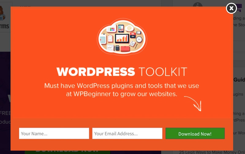
Take for example this lead magnet by WPBeginner, a blog centred around building and optimising your website on WordPress.
One of the biggest frustrations of WordPress users is identifying the right plugins and tools that are useful to grow the traffic of their websites.
WPBeginner recognises this and transforms this need into a toolkit lead magnet which leads to a win-win for them and their audience: WPBeginner builds their readership while the reader saves time and gets immediate insight to the best tools for their website growth.
2. Strategically Locate Your Signup Forms
Many different things can make or break the success of your signup forms.
The right lead magnet, good copy, even your CTA button can change the way your customers feel about your brand. However, one commonly forgotten factor is the placement of your forms.
You will need to locate your sign-up solutions in high-traffic areas of your website that are primed to elicit positive action from your customers.
For instance, the 3 top locations for any signup form include:
1. Your Home Page
Probably the most obvious place to put your sign-up form is on your home page. When uncertain customers arrive on your website, your homepage is the first thing they’ll see.
A sign-up form on your homepage will help you to capture some visitors who neglect to explore the rest of your site. Just make sure that the first impression you give is a good one, with a strong design and compelling copy.
2. Your About Page
Sometimes, when customers are interested in your company, but not ready to buy, they’ll head to the About Page.
In fact, if you load up Google analytics, you may find that your About Page is one of the most popular pages on your site. That’s because customers want to know you, and your story. After you make an emotional connection on your About page, make sure you take advantage of it with a sign-up sheet.
3. Within or After Content
Finally, someone who loves the content you produce will be more likely to sign up to get more. Placing a sign-up sheet at the bottom of your most helpful and popular content is a great way to attract new leads to your door.
Copyblogger does this well by locating their lead magnet and signup forms strategically in various sections of their website. They focus on the consistency of their call-to-action to ensure readers know it leads to the same outcome ‘Free Training.’
Their about us page:

Same exact lead magnet at the top of their individual blog post.

3. Optimize the Copy on your Sign-up Form
As mentioned above, the copy on your sign-up forms can make a big difference in your conversion rate too.
Customers need to see an equal exchange of value when they’re considering joining your email list. Because their personal data is precious to them, you need to convince them that they’re getting something valuable in return.
Your lead magnet will help with this, but your copy is how you’ll spark the emotion in your audience.
Remember these 2 golden rules for sign up copy:
1. Always Answer WIIFM
Your customers want to know “What’s in it for me.” This means that your sign-up form copy needs to immediately address the benefits that they’ll receive when they hand over their email address.
Tell them that being on your subscription list will give them access to the latest vouchers and blogs.
Remind them that your lead magnet is packed full of useful information. Whatever it takes to demonstrate that your email list is a VIP club your customers should want to join.
2. Deliver Social Proof
Additionally, remember the risk vs. reward component of sign-up sheets. Even if you have a lot of great benefits to offer, your customers will still be worried that you might misuse their information.
Show them they can trust you by drawing attention to social proof. For instance, you could say:
– Join 50,000 subscribers…
– See what our customers have to say [enter reviews]…
– [Name] loves being on our email list because…
When it comes to writing compelling call to actions, Pat Flynn of Smart Passive Income does this in spades.
His general subscriber form showcases strong social proof by highlighting the face that his subscriber count is beyond 150,000! Afterall, it can’t be that bad and should be somewhat useful if such a huge amount of people are subscribed to his email list.

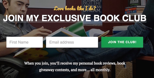
When looking to have different sign-up lists, it is critical to classify the difference to avoid any confusion between your readers that are looking for just your newsletter.
To attract the right audience for his book club, Pat specifically highlights what subscribers will enjoy – book reviews and giveaway contests, and probably not general tips on how to build passive income.
4. Optimize Your Call to Action Buttons
While the Call to Action button may only be one element of your email subscription form, it is one of the most important.
On average, people see around 247 marketing messages a day. Since most of those messages go unnoticed, it’s up to you to make your subscription form different.
Your CTA button is what pushes a visitor to go from being a prospect to being a loyal customer. Of course, even the smallest changes can make the biggest difference. For instance, personal words like “my” rather than “you” can be enough to increase conversion rate by 90%!
First up, make sure that you get the color of your call to action button right. You need something that prompts urgency, without indicating danger. Red might seem like the most obvious choice, but it has had negative results in the past.
Look for a color that contrasts with your website and consider your brand colors too. Good choices include green, orange, yellow and red. But make sure you A/B test each option to be sure!
Additionally, be cautious with your copy, remember to:
– Use active language: “Get Instant Access today.”
– Show the payoff: “Become an expert email marketer today.”
– Solve a problem: “Reduce bounce rates today.”
Better yet, is there a better way and a formula to optimise your CTA button’s copy
In an interview with GetResponse, Joanna Wiebe of Copyhackers laid down three key points for us to think about the button’s copy:
1) Don’t think of a CTA as a call to action. Think of it as a call to value. An action may be “Read the blog post about button formulas” but the value would be “Convert better with these 3 button formulas.”
2) Write button / CTA copy that completes this phrase: I want to ________________. The underlined part becomes the button copy.
3) Never introduce work in your CTA copy. So if you’re writing a newsletter that leads to a landing page where the user will have to sign in to watch a video, don’t write a CTA in the newsletter that goes, “Sign in to watch the video.” That’s introducing work.
Wordstream, an online advertising company follows this 3 pointers well.
With the value proposition already highlighted in the text, their CTA button copy shows exactly what the subscriber can expect once they sign-up: A Free Report. No gimmicks, no additional work done.

5. Utilize Exit Pop-Ups
What happens when you get everything right, from copy to placement, and your customers still hit the back button?
That’s when you need to make one last-ditch effort to remind them of why they should be on your sign-up sheet.
Popups can be a valuable addition to your email subscription strategy. While most people find entry pop-ups incredibly annoying, exit-popups can be very powerful when used correctly.
Copyblogger discovered that a good pop-up strategy could immediately increase email opt-ins. At the same time, Entrepreneur.com used exit pop-ups to increase their subscriptions by 86%.
Despite the anti-ad attitude of the modern marketplace, exit popups are valuable. They jump into action when a user is about to close a window on your website and remind them why they should stick around. Remember, to make the most out of exit popups:
Remind them what’s in it for them: Use your best lead magnet or benefit to keep their attention.
Use FOMO: Fear of missing out is a critical way to keep your customers around for longer. Remind them that they only have a limited chance to take advantage of this great offer. If they leave, they could miss out on something important. An example of FOMO copy could be: “Do you really want to lose 95% more conversions?”
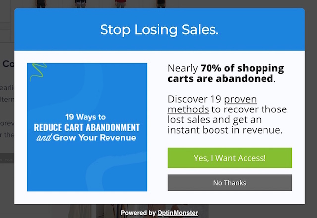
Optinmonster understands the power of exit popups and how to fully maximise their usefulness – it lies in crafting a compelling copy that frontloads incredible value.
By balance the right mix of fear and reward, their exit popup gets the reader to think of a while of the consequences of not acting – losing more customers and the benefits of signing up – an instant boost in revenue.
6. Consider “Locking” or Gated Content
Another great way to increase the signup rate on your website is to make it more exclusive.
Gated content is a controversial concept in the marketing world. It works by locking away some of your most valuable content and only offering it to people who are willing to sign-up.
While this can rub some customers the wrong way, it’s also a good way to gain subscribers if your gated content is valuable enough.
You’ll need to approach gated content with care, but if you use it correctly, the payout can be tremendous.
Remember, identifying your highest-performing content is critical here. People need to see that the reward that they’re going to get from you is greater than the risk of offering up their private information.
Use analytics to determine what your top-performing content is or consider polling or interviewing your customers to find out what they want to read about.
Just remember to use gated content sparingly. You don’t want to lock away everything, as some customers will prefer to get a taste of your content before they commit to a subscription.
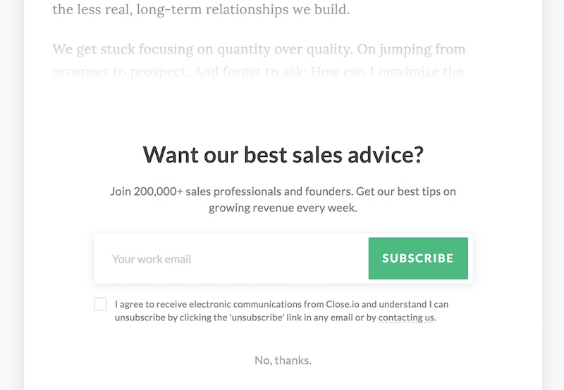
The Close.io blog that focuses on online sales uses gated content tastefully in a manner that places the reader in full control of the interaction. They lock away specific high-value long form posts with a subscription form.
Other than highlighting important social proof (their readership of 200,000) and the value proposition of revenue growth tips, they place an option at the bottom for the reader to skip this Gated Form and zoom straight into the content.
Counter-productive to the point of gated content?
Possibly, they could definitely lose some subscribers this way, but in the greater scheme of things, respecting your readers and giving them an option to choose is the better option by far.
7. Only Ask for the Most Essential Information
We’ve mentioned the risk vs. reward ratio a couple of times in this article. This is something you’ll need to keep in mind when you’re picking the questions for your subscription form.
Though it may be tempting to gather as much information about your target audience as possible, one of the main reasons people leave any page, is because they don’t want to hand out too much information.
Think of it like meeting a new person for the first time; you wouldn’t ask for all their personal details in the first half an hour.
Instead, just ask for your customer’s email address initially, and maybe their name so you can personalize the messages you send. Beyond that, you can probe for extra information at a later stage.
Decide what information you need and remember not to ask for any more than that. A case study from Marketing Experiments shows that conversion rates begin to drop the moment you add additional fields to your form.
If you are looking to build your email list there are only at maximum 2 pieces of information you need:
Their email address (mandatory)
Their first name (optional)
Everything else is quite unnecessary.
8. Consider Content Upgrades
Finally, consider adding content upgrades into your email subscription strategy.
A content upgrade is a way to give email subscribers a small reward when they join your list. For instance, you could let them know that they’ll get free PDFs of your latest studies when they join your list, or that they’ll be able to access extra case studies.
Content upgrades are quickly emerging as a great way to increase subscriber rates, by dangling the carrot of “You could get more” at the end of each post you produce. If your visitors already like the content you’re giving them, then it only makes sense that they would want more.
An example of a content upgrade could be blog posts that you turn into a PDF for your reader to download instantly on their email and read whenever they like.
You could also build on popular content and provide extra exclusive insights for your subscribers. The key is making sure that you’re giving your visitors something they want from your content – whether it’s a change in format or additional information.
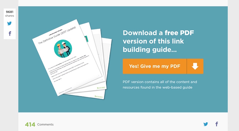
When Backlinko creates an ultimate guide for various topics such as their ‘Definitive Guide To Backlinks’, they don’t just stop at posting it as a blogpost to rank well for SEO & to give immediate value to readers, they go further and convert it into a PDF.
This allows readers who desire an handy offline backlinking guide to get one without easily by just subscribing.
Always Seek To Strengthen Your Subscription Forms
It’s impossible to argue with the potential of an email subscriber list. The contacts you gather are your way to keep conversions high, nurture new leads, and even retain your existing customers.
Of course, making your subscription strategy a success is easier said than done.
Following the tips, we mentioned above, from content upgrades to short forms, gated content, exit popups and more can all help to deliver the results you need. At the same time, structuring your forms for increased conversions with great copy, a compelling CTA button, and the right placement is crucial too. With a little luck, this article has given you everything you need to know to take your subscription list to the next level.
Get out there and start gathering those contact details.
