22 Conversion Principles for Optimising Your Landing Page (When You Can’t Test)
March 5, 2019 | Sean Foo

Landing pages are one of the most important elements of lead generation and conversion.
A landing page is any page on your website that your visitor arrives at after clicking on a link or advertisement.
Generally, landing pages are designed to prompt a visitor into acting – whether that means signing up for a newsletter, downloading an eBook, or making a purchase.
Without action from your customers, your business simply can’t thrive.
A landing page is different than any other component on your website because it focuses your visitors’ attention towards a specific goal.
Unlike the rest of your website, which can be entertaining, educational, or informational, your landing pages focus on one purpose: conversions.
Get your landing page wrong, and you’re left wasting your advertising budget on a campaign that never converts. Unfortunately, landing page mistakes are easy to make:
– 75% of companies struggle to find the help they need to optimise landing page copy.
– 44% of clicks generated by companies go to homepages instead of landing pages.
– Only 52% of companies using landing pages test them to ensure they’re delivering the best results.
The best way to optimise a landing page is by funnelling traffic into the page and conducting A/B testing to learn from your audience’s preferences.
However, if you don’t have enough traffic to facilitate testing yet, you still need a strategy for better conversions.
Here are 22 conversion guidelines and principles backed by testing, to help you set the foundations for a strong landing page.
Focus On One Purpose
It’s easy to get carried away when designing your first landing page.
After all, the chances are that you want your customers to do a lot of different things, from engage with your business, to sign up to your newsletter and buy your products.
The key to success is making sure that you don’t focus on too much at once. Landing pages need focus to drive action. So, how can you make sure your page stays on point?
1) Have One Goal & One Primary Call To Action
A shocking 48% of landing pages come with multiple offers attached to them. That’s a huge problem.
The number one rule of designing a good landing page is maintaining focus. Multiple offers and goals can reduce your conversions by as much as 266%.
Decide in advance what you want your primary goal to be.
In fact, you can always create multiple landing pages to make sure that you’re converting for all your business targets.
Your primary goal can be either capturing emails, getting orders, or something else entirely, but once you’ve picked something, you’ll need to stick with it.
Take Taskworld for example, their landing page’s primary goal is simple to get you to sign-up and try their platform.
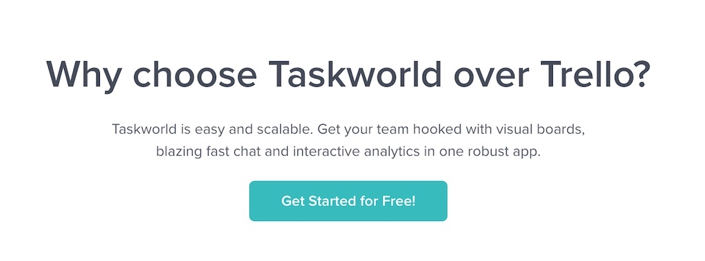
There isn’t any other links that leads you to a case study page, or one that brings you to an about us page.
Every necessary information is already displayed on the landing page itself and the only action a reader can take, if interested, is to sign-up for an account and give their platform a try.
2) Use Multiple Call-To-Actions
Just because every landing page you create should have its own unique goal, doesn’t mean you can’t use multiple call-to-action or CTAs in your design.
A simple call to action can be split into different segments that allow users to click on or choose the experience that best suits their needs.
This can help you to gather more insights into the leads you collect, as well as giving your clients a more personalised experience.
Importantly, to use multiple CTAs correctly, you must position them carefully throughout your page design.
Place CTAs around the hero section, underneath your features and benefits, and around your testimonials, where user trust levels and buying intentions are higher.
Additionally, all of your CTAs must also lead to the same purpose – the next stage in your buying funnel.
Zohodesk places their CTA twice in the landing pages below.
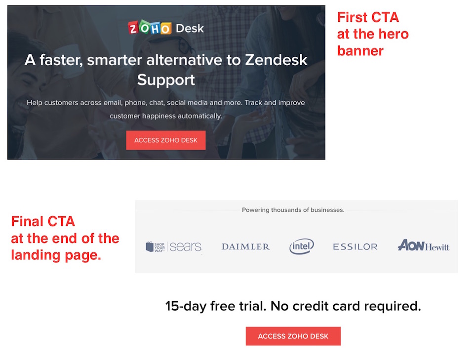
Once in the hero banner to capture sign-ups from users that either recognise their brand or are eager to give the solution a try.
The final CTA, at the end of the landing page just after the social proof logo features, is also good practice, to convert readers who have gone through the entire sales pitch and are at a more informed point to make a decision.
Practise Simplicity In Design
Design is a critical component of landing page creation. While the words you use will have a significant impact on your conversion rates, you need to get the format of your pages right first.
Make sure that you keep your designs as simple and clean as possible, with clear pathways of information for visitors to follow.
3) Utilize Relevant Visuals
Your visuals help to bring life to your landing pages.
Eye-catching graphics help to compel visitors to act, by connecting with their emotions. According to a study from Content Marketing Up, around 40% respond more positively to visual information, compared to regular text.
Your visuals will only be valuable if they’re relevant to the page.
For instance, if you’re trying to capture leads for a life insurance product designed for families, images of parents and children combined with reassuring colors like soft blue can help to increase feelings of stability and trust.
As a rule of thumb, use high-quality product images, and avoid anything that takes the focus away from what you’re offering.
Overuse of stock photos is an absolute no-go, as they make your business seem insincere.
While many software companies choose to use real-world visuals and high-quality photos, Basecamp breaks the mould and uses a vibrant hand-drawn cartoon banner to highlight the chaos in a funny way the chaos users are feeling when their business is disorganized.
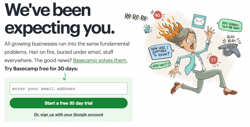
The result? A very whacky and memorable visual that isn’t easily forgotten!
4) Encapsulate Your Call-To-Action
As web design trends continue to change, companies are beginning to embrace brighter, more vibrant pages to engage their customers. While bright colours, animations, and exciting graphics can help to capture audience attention, they also make it harder to draw focus to the most important parts of your page – including the CTA.
The CTA button needs its own specific section within the landing page, and it needs to stand out. A good way to make sure that your CTA is clear and actionable is with encapsulation.
Encapsulation is simply the process of using a container or segment to highlight the content inside. For instance, you might draw a border around your CTA button with plenty of white space. This makes your CTA stand out in a sea of additional information.
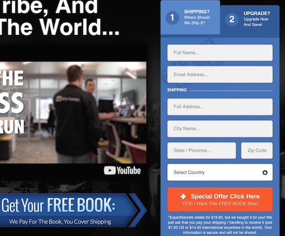
When it comes to creating landing pages, Russell Brunson’s team at Clickfunnels are perhaps some of the most seasoned professionals, after all their business is around helping their customers build their marketing funnels from scratch.
When it comes to conversion optimization, Clickfunnels makes it ultra-obvious by encapsulating their CTA, showing their customers where to go and how to proceed to get their free book.
5) Keep Your Sign-up Form Simple
Action is the primary focus of a landing page. Unfortunately, getting your lead to ask can be quite the challenge. The last thing you want to do is make the process any harder than it needs to be, by asking for too much information, or including too much confusing information.
When it comes to creating your sign-up form, make sure that you only ask for the information you absolutely need. Make sure that your customers don’t see filling out your form as a chore. People will naturally follow the path of least resistance, so give it to them.
For instance, if you’re getting email addresses for a newsletter, a first name and email address are all you really need.
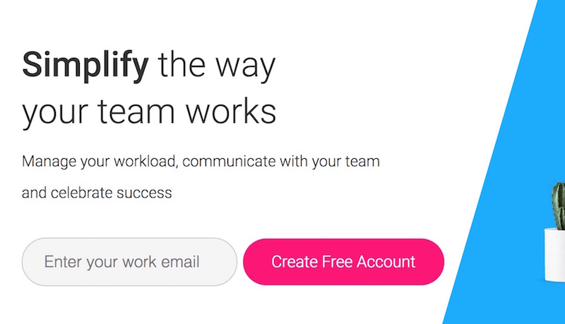
While you might require more information, the initial request should be as little as possible, and Monday.com does this well. By asking only for your work email, they make it easy and reduce any resistance to sign-ups.
6) Use Directional Cues
Sometimes, the best way to improve the performance of your landing pages is to understand how people look at them. Most customers in the digital space don’t have time to intensely read every word of content. Instead, they scan your page, looking for the information they need.
Directional cues act as visual aids, helping your reader to focus on specific points within the page, like the benefits and features, testimonials, and even the call to action button.
There are two forms of directional cues: explicit, and implicit.
Implicit directional cues are subtle.
They’re designed to draw the eye around the page and create a natural sense of flow without being too overbearing. Implicit cues include white space, colour contrast, and encapsulation.
On the other hand, explicit directional cues are more obvious. Your explicit cues might include arrows, lines, and strategic object positioning surely to capture attention.
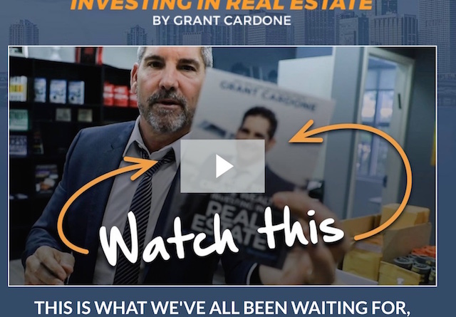
Grant Cardone, arguably the master of sales, uses directional cues to get visitors to take action on the important parts of the landing page.
In this case, his introduction video chock full of information and value for the viewer – making them more keen on buying his product later down the line.
7) Create Breathability Through White Space
While customers need information to make a decision, they don’t want to be plagued with too much content at once.
User experience is an important component of a landing page, and white space can help to add breathability to your page, so your visitors don’t feel overwhelmed.
White space not only adds more sophistication and professionalism to your page, but it also ensures that your prospect can pay attention to each of the most important components of the page – including your call to action. White space provides:
– Improved focus
– Better comprehension
– Increased readability
– Enhanced user experience.
By eliminating information overload, you improve the chance that your customer will feel comfortable and confident making a purchase or taking your desired action.
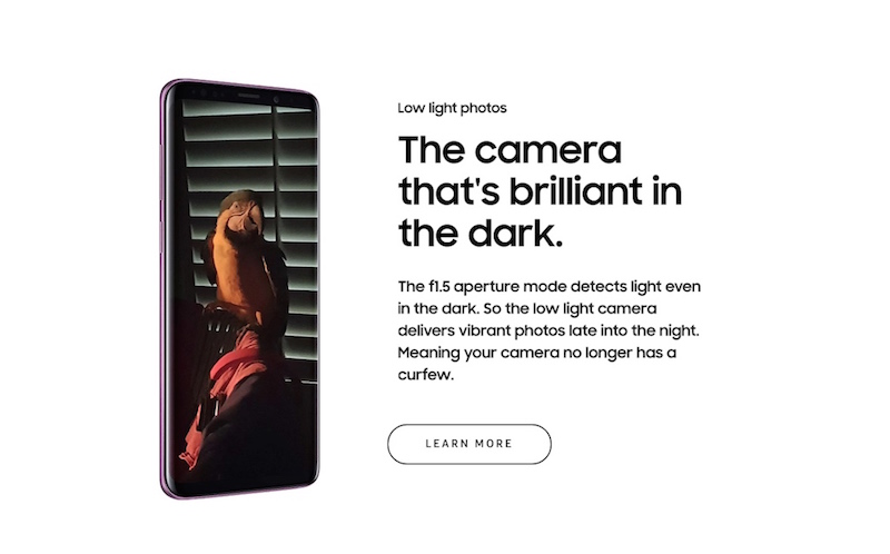
Samsung does an outstanding job utilising white space to focus their viewer’s attention to each feature of their Galaxy S9 at a time.
Ensure Clarity
Following on from good design, it’s critical to make sure that the purpose and value of your landing pages are clear.
You don’t want people to be distracted by flashy graphics or lengthy blocks of text. You want your customers to convert.
8) Use Language Your Audience Understands
The language you use in your landing pages can either make or break your conversions. Choose complicated words and phrases, and you’ll lose the attention of your target audience instantly.
While you might think that your jargon-filled content makes you look professional, it makes it harder for your customers to understand what they’re getting in exchange for their action.
For instance, if you’re selling software for Salesforce, you might think that it’s a good idea to use terms like CRM, AI, or UC – but the wrong word could alienate a customer who’s new to your market.
Good landing pages avoid jargon and technical language as much as possible.
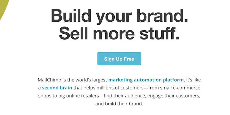
Many savvy marketers use email marketing platforms to reach their customers and would easily understand jargons like conversion rates, open rates and bounce rates but MailChimp knows not everyone does.
By structuring their language to cater to the broader audience and focusing on the key benefits every business owner desires: more customers and a stronger brand, they allow more of their audience to connect with and understand what they are about.
9) Lead With Benefits Then Justify With Features
In most cases, conversion always comes down to one thing for customers: WIIFM (What’s in it for me?) Your customers want to know that you’re offering something that they genuinely want or need.
That doesn’t mean just listing features that look good on paper – it means showing your audience what they can get out of your product or service.
For instance, don’t tell someone that your accounting software comes with automatic updates – tell them why that feature will help them to reduce the need for manual backups, and improve productivity by a certain percentage.
Decluttering landing pages and highlighting incentives improved conversions for one company by 13.98%.
Every section of your landing page should start with benefits, then follow up with features. Capture your customer’s hearts first, then use logic to justify what you’re offering later.
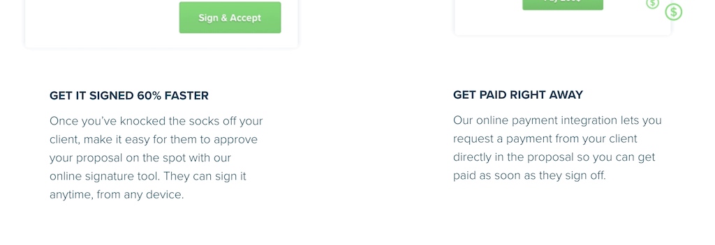
Proposify, a Saas business that helps clients in creating beautiful and efficient proposals, understands the importance of leading with benefits and justifying with their features.
By understanding the needs and pain points of their target audience, freelancers and agencies, they zoom into the big benefits that keeps their clients up at night – getting the proposal signed and getting paid.
These benefits are then justified by their respective features (signature tool and online integration) that make it possible.
10) Proper Link & Clarity From Ad to Landing Page
Your landing pages should never disappoint your customers. When a visitor clicks on your PPC ad, email, or call to action, they’re expecting something specific on the other side.
That means that if your ad tells someone that they can click to download your free eBook, they should get a free eBook when they arrive on your landing page.
Landing pages need to be a direct continuation from your ad campaigns. You need to follow through on whatever you offer.
If you fail to live up to your promises, then you risk leaving your customers with a “bait & switch” feeling. While it might be still true and on offer, if your customer can’t immediately access it, they might assume it doesn’t exists.
Imagine if you clicked on an ad that promised 50% off a certain product, and then arrived on a page to find a different product with zero discount – you might be left in a state of confusion.
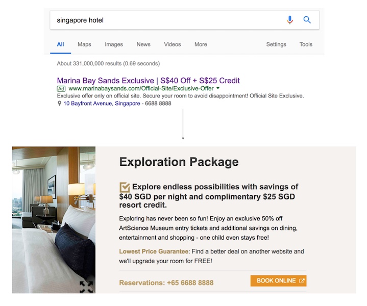
When it comes to Adwords advertising, Marina Bay Sands does this well by making their ad copy congruent with the offer on their linked landing page, immediately showcasing the original offer that made their prospects click in the first place – $40 off plus a $25 credit.
Capture Attention At All Cost
Once you’ve spent your time and effort creating an advertisement or email driving people to your landing page, the last thing you want is for them to click the “back” button as soon as they arrive.
Capturing attention is how you make sure that your customers stay interested and engaged long enough to convert.
11) Save them from their ‘hell’ and Deliver them to their ‘heaven.’
The incredible content marketer, Aaron Orendorff says that success in the digital world is all about saving customers from their personal hells and delivering them into heaven.
In other words, there’s nothing more captivating than the promise that someone can help you overcome your pain points and achieve satisfaction.
To capture your audience’s attention with your landing page, start by letting you know that you understand what they’re suffering with.
Explain the situation you know they’re facing, then follow up with an insight into how you can make the issue better. A great way to do this is with headlines. For instance:
– Sick of losing your hair? This formula boosts hair growth by 200%!
– Struggling with customer conversions? Use this guide to boost profits by 56%!
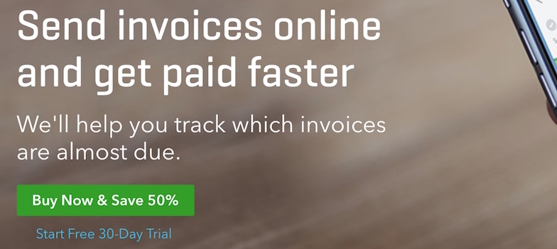
Quickbooks understands this well and highlights the ‘hell’ most of their customers are facing: Not being able to track invoices which are almost due, while also delivering them onto their heaven: Getting paid faster.
12) Crafting A Compelling Headline
Speaking of headlines, these components are a very important part of your landing page strategy.
A headline is an opportunity to immediately focus your visitor’s attention and show them that you have something valuable to offer.
In simple terms, headlines are the big-screen flashing lights that grab your audience’s attention. Many different elements make up a compelling headline, including:
– The promise to escape pain: “This simple lotion will eliminate dry skin for good”
– A big picture benefit: “Stop dieting with a sustainable solution for fat loss.”
– Insight into authority: “98% of dentists agree this toothpaste will give you whiter teeth.”
– Contrast: “Tired of low energy? This caffeine-free supplement will super-charge your body.”
You can combine different elements above to make the most of your headlines too. For instance: “Sick of dry skin? 90% of beauticians use this lotion to eliminate dry patches.”
13) Your Hero Section
The Hero section is one of the most important elements in any landing page because it’s where you start to truly resonate with your audience.
The Hero section is where you can begin to communicate with your customer on a deeper level and convince them to visualise themselves using your products.
The hero section contains a range of different and important factors, including:
– Social proof designed to improve customer trust
– A compelling headline
– Subheadings that connect with the emotions of your reader
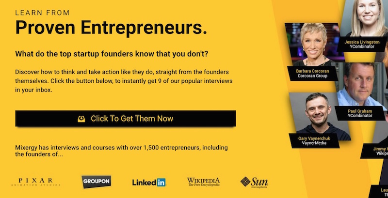
Take for example the hero section below from Mixergy which follows the three important points mentioned above.
Social proof to build trust? Check!
They not only mentioned having access to over 1,500 entrepreneurs, they also threw in logos such as Pixar and LinkedIn together with headshots of instantly recognisable influencers, this is perhaps one of the strongest social proofs ever seen.
Compelling headline & subheadings? Check!
Their headline ‘Learn From Proven Entrepreneurs’ clearly highlights the value of taking action while the subheading ‘What do the top startup founders know that you don’t’ piques interests and makes it even compelling for the reader to check it out.
Inflame Their Desire
Once you’ve captured your visitor’s attention, you need to deepen that relationship. Inflaming desire is all about convincing your customer that they must take action.
The more you can provoke desire in your audience, the more likely they are to convert.
14) Weave The Benefits To Suit Their Desires
The easiest way to create desire in your customers is to show them the benefits of whatever you’re offering, in the context of their situation.
In other words, let them know why they should bother filling out your landing page forms in the first place.
Your benefits section is one of the most important sections of your landing pages, but you need to remember to personalise what you’re offering so that it appeals to your customer’s idea of the ideal situation.
For instance, if you want to capture the email addresses of IT professionals to get them to purchase your accounting software, you could just say: “This accounting software will help you save time.” Or, you can get more personal and say: “This simple-to-use accounting software helps CIOs complete budgeting tasks in 33% less time.”
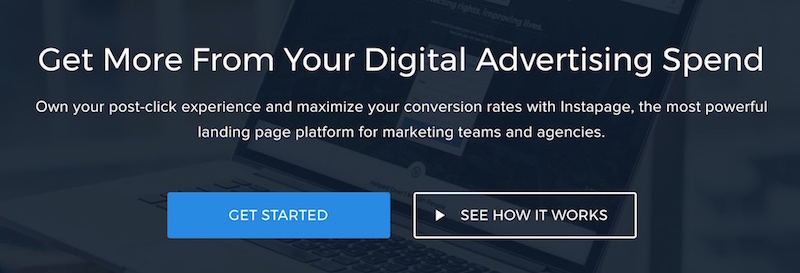
Take these two hero sections from the landing pages of Unbounce & Instapage, two competitors vying for dominance in the landing page builder market.
It can be easily seen that the language here are largely similar and uses technical terms and jargon easily recognisable by marketers.
For Unbounce, they focus more on the ease of use, conversions and the speed of launching campaigns, showing they are speaking more generally towards marketers done by just highlighting the overall benefits.

While Instapage speaks directly to marketing teams and agencies and focuses on the big benefit these teams seek – maximising their advertising spend.
15) Use Visuals: Show Them A Better Version Of Themselves And Their Business
The human brain loves visuals.
Your mind is constantly working to make sure that you can accurately process the things you’re seeing.
Around 20% of the brain is reserved specifically for processing vision, which is why we can understand images so quickly.
Visuals in your landing page content can help you to convey complex information in a simpler way while encouraging customers to visualize further with your product or service.
Consider the fact that 73% of US adults say that they’re more likely to purchase a product after they’ve watched a video explaining it.
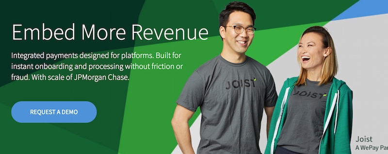
WePay utilises the visuals of happy and smiling entrepreneurs in their hero section.
Even without reading the headline or the supporting text, the viewer can immediately feel the emotions of using the payment platform – joy, laughter and happiness. Picture perfect.
16) Anchor the Product Value
If the purpose of your landing page is to get someone to buy something, then you’re going to need to help them part with their hard-earned money.
The relationship between value and cost is a complicated one.
Your customers want to know that they’re getting the right value for the amount they’re spending.
But if they’re not familiar with your product or service, all they have is your word to let them know they’re getting something great.
One way to boost your chances of conversion is to anchor the product value. This simply means showing a huge range of benefits to make the price of the product seem comparatively small.
If it helps, you can even compare the price of your product with competitor items.
However, it’s important to make sure that you’re not comparing your offering to something with more features or benefits.
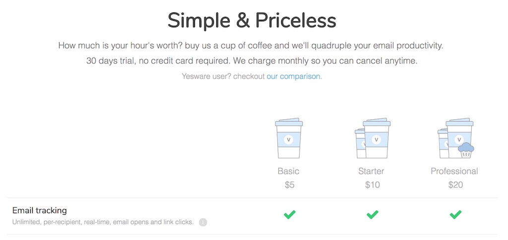
Vocus, an email productivity software uses an interesting way to anchor the price of their software, comparing its price tag to that of a cup of coffee, reducing any resistance to taking action.
Earn Their Trust
Trust is everything in today’s buyer journey.
If your customer doesn’t believe that they can trust you to deliver a great product, service, or experience, then they can easily go and find what they need elsewhere. The statistics are rather clear:
– 84% of people trust online reviews as much as personal recommendations
– Every one star increase in Yelp ratings leads to a 9% increase in revenue
– Online reviews can impact 67.7% of buying decisions.
17) Use Effective Testimonials
Using social proof in your landing pages is a great way to demonstrate your value to your audience and help them to believe in what you have to offer.
Ultimately, while you can share your benefits and features with your customers as much as you like, people will always believe the opinions of third-party customers more than the companies trying to make a profit.
Testimonials are an excellent source of social proof. However, you need to make sure that you’re getting the most out of your reviews. For instance, follow this proven structure to help make your testimonials more engaging:
– The customer story – which problems they faced before they came to you
– The reason – Why they chose you over a competitor
– The benefit – The positive results of your solution
– The outcome – Any tangible statistics or outcomes you can share.
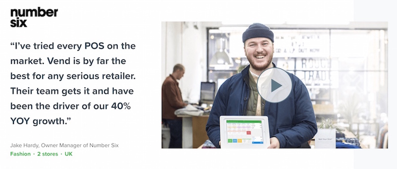
Vendhq uses a combination of the traditional testimonial copy together with a video testimonial that brings the viewer through the process of how Vend is helping to transform their business.
18) Highlight Media Mentions
Customer testimonials aren’t the only way to develop social proof for your website. Psychologists believe that people will judge the value of someone else’s opinion, based on the established image of that individual.
In other words, if you can get reviews from credible groups, forums, and brands, then your credibility goes up too.
Media mentions from newspapers, magazines, ezines and even other companies in your industry is a great way to raise your social proof levels.
You can apply for mentions from companies like TechCrunch if you’re a SaaS vendor, or the BBC if you just want to generate attention from a wider audience.
Press releases are also an easy way to get the attention of media groups.
How to do utilise media mentions? Easy! Just feature the relevant logos on your website.
As one of the top performing content marketers around, Ryan Robinson understands the power of being featured in the media and proudly showcases them his page, linking each logo to the relevant article for that specific platform.

19) Showcase Clients and Brand Logos
Another classic example of social proof. If you want to demonstrate the authority of your product or company to new customers, then one of the best things you can do is align yourself with companies or organizations they already trust.
For instance, if your B2B client knows that you’ve already worked alongside other high-performing businesses in their niche, they’ll know you can be trusted.
Simply including logos and client information from people you’ve worked with before on your landing page is enough to significantly enhance your credibility.
Saleshandy proudly showcases their customer logos on their page as well as an additional injection of social proof of users from over 2,500 cities using their email solution.

20) Include Influencer Endorsement
Influencers are one of the best-known sources of social proof today.
When you work with an influencer to improve the impact of your brand, you effectively piggyback on the pre-existing reputation of someone your customer already knows and trusts.
In fact, around 70% of millennial customers say they’re influenced by the recommendations of peers when it comes to making buying decisions.
When you include influencer endorsements, it’s important to choose someone who’s relevant to your industry. Just adding a famous face to the mix isn’t enough.
For instance, if you’re selling a social media marketing tool, it makes sense to reach out to niche influencers like Jeff Bullas or Neil Patel.
Don’t just look for someone who you consider to be “famous,” think about who will appeal to your audience.
Sumo understands this well and doesn’t just restrict themselves to testimonials from ordinary users, they specifically feature testimonials from big influencers in the blogging space that their typical prospects all recognize and aspire to be. Influencers exactly like Pat Flynn.

Inspire Action
Finally, you’ll be ready to inspire action from your audience. This means a lot more than simply creating the right call-to-action or offer for your campaign.
You need to tap into proven psychological principles that convince people to buy, sign up, or connect with your brand.
21) The Sense of Urgency & Scarcity (FOMO)
One of the best ways to inspire action in your customers, and get them to move fast, is by letting them know that they only have so long to make a move.
Telling your clients that there’s only a limited amount of an object left or a limited time to get it instantly motivates them.
According to Psychology Today, the concept of scarcity engages our “Fear of Missing Out,” and pushes us to act quickly.
That’s why Amazon shows you how many of a product it has left on the page, and other companies use countdown clocks clicking down towards the end of a sale.
Importantly, you’ll need to use this strategy with care. Offering an online product like an eBook and saying that you only have so many copies left doesn’t make sense.
However, you can always say that your customers only have so long to take advantage of a discount.
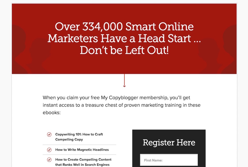
In their landing page, Copyblogger uses the power of FOMO well by explicitly letting the reader know a huge number of marketers have seen the secrets of their training and getting ahead if they don’t sign-up.
22) Reversing Risk
Finally, you may need just one last push to encourage your customers to act. Last minute resistance and worries about spending money can derail sales at the last second.
Tackling this issue is hard, and the best thing you can do is track your customers to find out why they’re leaving your checkout at the last moment.
However, in the meantime, consider ways that you can preemptively address the risks that your customers are encountering.
For instance, can you offer a money-back guarantee that lets them know they’re going to get satisfaction, no matter what?
Buzzsumo, a popular content research tool, is well aware of some of the perceived risks and objections in the back of their customer’s minds:
– Is this tool really beneficial for my business? Can I give it a try?
– What if I pay and I don’t like it, will my money be wasted?
– I would like to get it a trial but I’m not comfortable having my credit card details stored on file yet.

In their final call to action, Buzzsumo effectively addresses all the potential objections by giving a 7 day free trial without the need of collecting any payment details.
Maximum benefit plus total security for the user – who wouldn’t give it a try!
Conclusion
Creating a landing page for your next campaign is hard work, especially if you don’t have any initial traffic results to base it on.
But with these list of 22 conversion principles, you can effectively optimise your landing page with best practices that have worked for many of the best online businesses around and will for yours as well!
