How Different Colors Affect Your Conversion Rates
January 27, 2019 | Sean Foo

The world as we know it is flushed full with various color. Some colors cheer us up and bring back a happy memory, others might fill us with seriousness while some colors including blue create a feeling of trust.
But is color really a critical component for conversion optimization?
How do colors affect conversion rates?
Will some color combinations drive up conversions to new heights while others plunge it down?
Conversion Marketeer Neil Patel states that ‘Color is 85% of the reason you purchased a specific product’.
According to the 2006 study ‘Impact of Color On Marketing’:
Within the first 90 seconds, people make a judgment about a product if they are going to buy it or not and 90% of the verdict is based on color alone!
And it gets crazier, Quicksprout had a study that came to an interesting conclusion:
66% of people won’t buy certain appliances unless it comes in their preferred color!
So how do we correctly use the right type of colors on our websites and landing pages?
Before we answer that question, we need to understand the different color types & their consumer psychology.
Different Colors Spurs Different Emotions
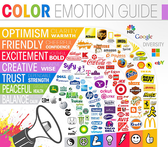
The infographic above shows how we perceive a brand by just the colors they use in their logos and marketing.
Oil companies like Hess and BP choose the color green to convey a sense of peace and growth while brands like KFC and Coca-cola utilize red colors to stimulate feelings of hunger and excitement.
However, does red really bring out hunger and stimulate the appetite?
According to this study, it concludes hunger might actually be suppressed by the color red because it acts more of a ‘stop’ sign.
Red, it seems only stimulates hunger if you are a fish.
Cultural meanings for colors increases the complexity of making the right selection.
While red might mean danger or a warning in western societies, in China, red is the color of prosperity and joy.
White might be a symbol of purity and simplicity in the west, but in the east, white is associated with mourning and death.
Context is king.
So what is the right way to approach this color issue?
While the best way is to A/B test every single color, this will probably drain you and your business of valuable time.
A better approach would be to understand the basic characteristics of popular colors we see in virtually every landing page today and decide which color best fits the type of business you are building or the type of product you are selling.
The 7 Important Colors You Should Know
1. Blue – The Color of Trust
Perhaps the most used color in landing pages and web design is the color blue.
Why?
Because blue inspires trust, peace and order. (source)
Blue brings back to us feelings of tranquility, security and calm. (source)
Going into deeper research, it is found that because of the emotions of peace and calmness, websites with blue as a core color tends to communicate better and clearer with their audience.
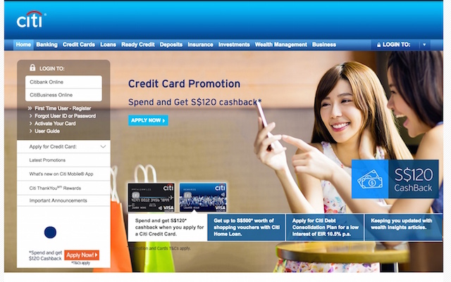
Take for example Citibank.
For a banking giant whose entire business is built on trust and order, the color blue for their website brings forth clear communication and inspire a feeling of stability.
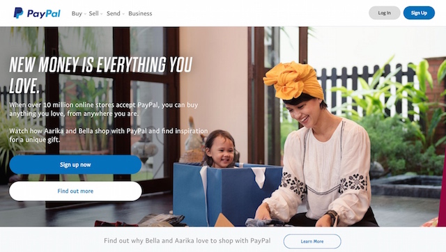
Paypal, a company that oversees and handles billions of dollars of transactions daily utilizes the color blue to help improve their trustworthiness as a middleman and to enhance their customer’s perception of Paypal’s security.
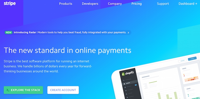
Even Paypal’s primary competitor, Stripe, uses the color blue as their website’s main color to inspire trust in their service.
They use a different shade of blue with a gradient tone to grant the page a modern feel, but the underlying emotion of trust is the main emotion Stripe seeks to instill in their users.
It is no wonder industries like finance rely on blue to pass on the correct emotion of stability and trust to their customers.
If your business relies heavily on trust such as law, finance and cyber security, blue might just be the correct color for you.
2. Yellow – The Color of Happiness
Now yellow is notoriously hard color to utilise in a business’s website.
While it represents happiness and playfulness, if used wrongly could also trigger feelings of warning or even anxiety like a warning sign!
But if used in the correct business or situation, yellow can bring out the full impact of fun and enjoyment of a particular product or service.
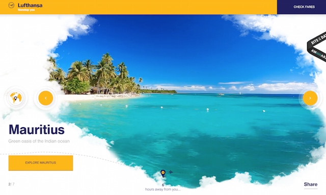
Take Lufthansa’s microsite promoting wonderful and exotic holiday getaways.
They cleverly used the color yellow to paint a world map background with different weights to prevent any unpleasantness to the eyes and still bring out the emotions of happiness and optimism.

Virtual pet game Neopets uses the color yellow strategically and sufficiently to bring out the enjoyment factor and optimism on their homepage making it look like a joy magnet bringing out the little kid in us.
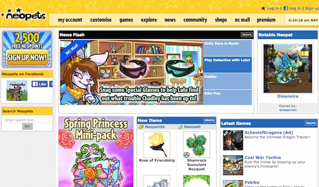
Yellow color also works remarkably well when it comes to choosing colors for your call-to-action buttons.
However, a cardinal rule that should not be broken if you want more conversions and if you respect your audience’s eyes: Never use a yellow font on a white background.
3. Red – The Color Of Passion & Excitement
Perhaps one of the brightest and most controversial color to choose for your webpage is red.
An article from BBC explains that the color red not only brings about emotions of passion and excitement but associations of dominance and aggression.
The color red promotes the desire for increased risk-taking, according to a study, Playing with red poker chips seem to make people bet more than those using blue or white tiles.
Is red associated more with attractiveness? This study seems to think so: both men and women are rated as more attractive when wearing red compared to other shades.
Now I want you to think of a red sports car speeding past a highway.
What was the first thing that came to mind?
Chances are it is a Ferrari.
And its no surprise, Ferrari’s signature model has always been marketed aggressively in its red color to bring forth feelings of dominance and risk-taking.
They cleverly used red as one of the main colors in their website design as a subtle reminder to prospects that to own a Ferrari is to win the game of life.
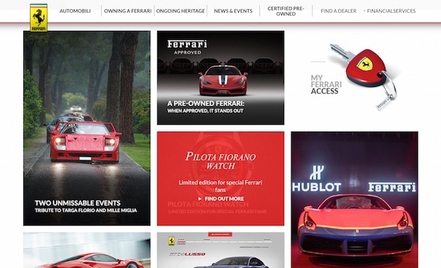
While your thinking red is definitely suited to race cars and the sports business, think again.
If your product has something to do with excitement and entertainment, red might also be the perfect color for you.
Take Netflix for example, they use the color red on their website strategically.

Instead of decking out the background in red, they used red in their Call-To-Action buttons as well as showing the red logo multiple times on their various programs. A subtle reminder that every program they have probably is exciting and a blast to watch.
4. Black – The Color Of Luxury & Exclusivity
Ever been to a website that uses black or dark colors as their background and start to think: ‘Wow the services and products here probably cost quite a bit, can I afford it?’
Creation of that feeling isn’t an accident. According to a piece by Business Insider, the author explains the importance of the color black:
“Black can also be seen as a luxurious color. Black, when used correctly can communicate glamor, sophistication and exclusivity”
When I venture into a black website, chances are it also inspires a feeling of elegance and timelessness.
Take Arch Motorcycle, Keanu Reeve’s company. Yes THAT Keanu Reeves who was in John Wick & the Matrix.
Black is used on their website probably to elevate their brand with a sense of sophistication as well as exclusivity. This definitely isn’t an accidental choice, each of these bikes can go beyond $105,000 a piece.

Now there isn’t a need to deck out the entire of your site in black just to show exclusivity and value. Too much black might actually frame your business as too expensive and drive away your audience even before they see your offerings.
Is there a way to have a balance?
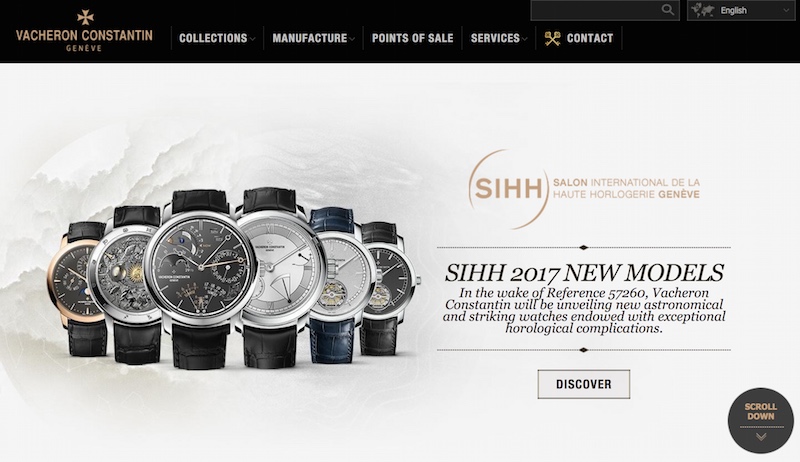
Definitely. Take a page out of Vacheron Constantin’s website.
As a luxury watch company, they elegantly used black as menu borders while having a white-creamy background to communicate approachability.
5. Green – The Color of Growth & Nature
One of the most popular colors (that even I use it for my own business) is green.
Green is the symbolic color of the environment, of nature and more importantly, it also represents growth.
If your business has anything to do with nature, the outdoors or organic, you owe it to yourself to select green as one of the primary colors for your webpage.
If your product or service is tied to making money, growing an aspect of your client’s life, green is also a fantastic color.
Take Vend, a SaaS product that focuses on growing their clients’ business and revenue. Not only do they use green to communicate growth to their audience, but they also use it in their call-to-action buttons.

According to the von Restorff effect, which states that you remember things better if they stand out, it helps tremendously in digital marketing whereby your next conversion step is of a particular color that stands out.
Green is a great color to accomplish that, and if your business is suitable, green can be used as the call-to-action color for your buttons.
6. White – The Color Of Neutrality & Balance
Is white even a color?
Yes, it is.
According to Forbes Contributor Amy Morin, ‘White has a modern appeal. Apple, for example, has used white to brand their clean, sleek look.”
White is the color that creates a sense of spaciousness, balance and breathability. It gives generous space to a website and accomplishes that modern feeling that many digital marketers seek today.
If you are striving for a minimalistic feel for your website, if you believe less is more, white is the color for you.
Take Apple’s biggest competitor, Microsoft uses white with some gray to accomplish that modern and clean feel most technology companies are striving to attain today.
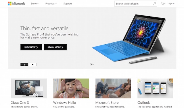
However, before you jump onto the white color bandwagon, it should be noted that other elements of your website should have dynamic colors. Too much white can lead to boredom and monotony if the other elements on your page don’t stand out.
7. Orange – The Color Of Impulse & Action
Now there is a reason why orange is extensively used in call-to-action buttons, it is to stand out and get those readers to click and buy your product!
Why is that? According to this article in Forbes “The orange color in Home Depot’s logo, for example, helps customers view them as a low-cost provider of valuable goods.”
This is further reflected in their website color scheme.
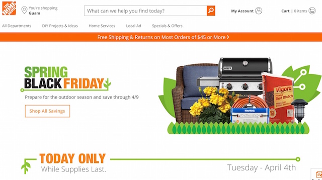
Orange is often linked to budget products that are value for money. It is no wonder companies like Jet Star Asia, a budget airline, uses orange extensively on their websites.

Now that you probably have a good understanding of these 7 important colors, what do we need to keep in mind when choosing colors for our websites or landing pages?
3 Rules For Colors & Conversions
If you are confused about how to select the right colors for your webpage, have no fear!
Outlined below are 3 rules to remember to optimize your color selection and make it easier and fun.
1. Your Call-To-Action Color (CTA) Needs To Stand Out
We all know that the call to action buttons have to be visually prominent and definitely a different color compared to the rest of your website.
However, to what extent must this color contrast be?
What is considered a low contrast versus a high contrast?
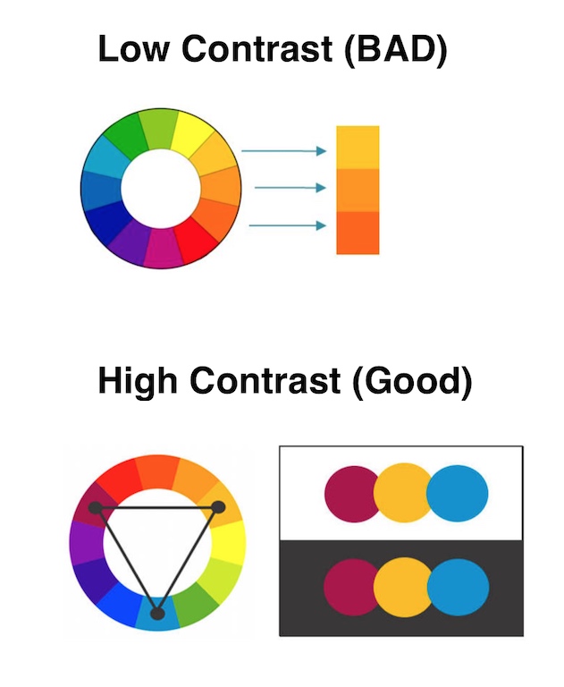
Take the following chart below. If your button color is low-contrast against your background color, visibility will be poor and your CTA will just blend it.
But when you select a color of higher contrast, suddenly your CTA stands out and is much more prominent. This small tweak will increase your conversions massively!
Take for example Hubspot’s blue CTA button. While blue might not be the brightest color for a CTA, it works and stands out in this example because of the other elements on that strip.

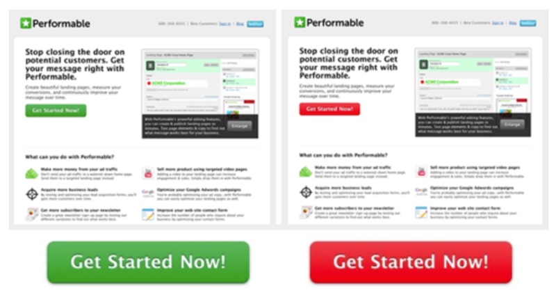
In one test Hubspot found that red buttons worked better than green buttons.
Is that the rule? Not exactly, red and green can both work as the call to action colors, but in this case, it is quite clear to see why the red button led to 21% more conversions.
Because the rest of the page elements contained green and using red, more contrast is created.
The red made the call to action much clearer and prominent.
So how do we choose the best complementary colors for our CTAs?
I present to you two solutions.
Using the color wheel, either stick with complementary colors or Triadic colors when deciding your website and CTA colors.
If the majority of your website is yellow, red and blue can be selected for your call-to-action colors.
If your website is predominately yellow, purple can be a good choice for a CTA that stands out.
2. Choose Colors That Match Your Brand
This is why we covered the 7 color types earlier.
Your color selection needs to match your current brand, or if you are a new startup, your colors need to portray the feelings and emotions you would showcase.
Just imagine a luxury watch brand uses a bright orange background on their website.
Doesn’t make sense, orange is associated with the idea of value for money and budget shopping.
That is one bad color to associate with watches that cost thousands to millions of dollars!
Take for example the Vertu luxury phone that starts at $10,000 and boasts additional services including concierge, limousine and bookings at the owner’s fingertips.
The colors clearly match their brand. White for the modern feel and black for luxury and exclusivity.
Just imagine now the same website using orange and yellow. A big mismatch between their brand and the emotions they are trying to inspire.
3. Use The Colors Consistently
After selecting the top 2-3 colors for your business and website, another important aspect that you need to control is how to use those colors.
Take call-to-action buttons for example.
Let’s say you choose green for your sign-up button, in order to bring a sense of consistency for your customer, you will have to associate green for all other call-to-action on your websites.
How like Vend does it. That removes any possibility of confusion for their prospects by streamlining their call-to-actions to only one color.
Their enquiries feature a green CTA button

Green CTA for their downloads.

Their video links guided by a green CTA button.

Colorful Takeaways
While it is near impossible to determine the exact color that matches your audience’s taste, it is better to decide on and choose the colors that reflect the values and emotions you want your brand to convey.
While different colors affect conversion rates, there isn’t a need to feel overwhelmed!
Start with choosing the top 2-3 colors that best match your company, ensure your call-to-actions have a good contrast and finally maintain color consistency throughout your website and you are good to go!
