How To Write A Winning Contact Us Page (Plus 21 Examples!)
June 13, 2020 | Sean Foo

When we think of a website, the contact us page is often just an afterthought, but it is one of the most important website pages you have to pay attention to!
Your contact page is where your visitors will go to interact and get in touch with your business – it is a call-to-action in itself.
A well-crafted contact us page opens dialogue and conversation with your customers – allowing you to discover new ideas, customer support issues and even a direct sale!
The Goal Of A Contact Us Page
Browsing a website sometimes leaves your visitors with burning questions that need answering or it could be your existing customers that are having difficulties with your product.
Your contact us page’s mission is to make it easy and simple for them to get in touch with you.
This is done by letting the reader know the methods to get in touch with your organization (email, phone call etc).
2 Big Mistakes To Avoid With Your Contact Us Page
Great contact us pages aim to make things easier for visitors to get in touch and they accomplishing this by firstly avoiding common mistakes such as:
Leaving only one way to contact you: Let’s face it, people have their own preferences, some prefer to call, others would rather email and some would want to do it directly on your website through a form. Give your visitor options!
Including a ton of unnecessary fields in the contact form: If you just need their name and email, then there isn’t a need to ask for any other personal information.
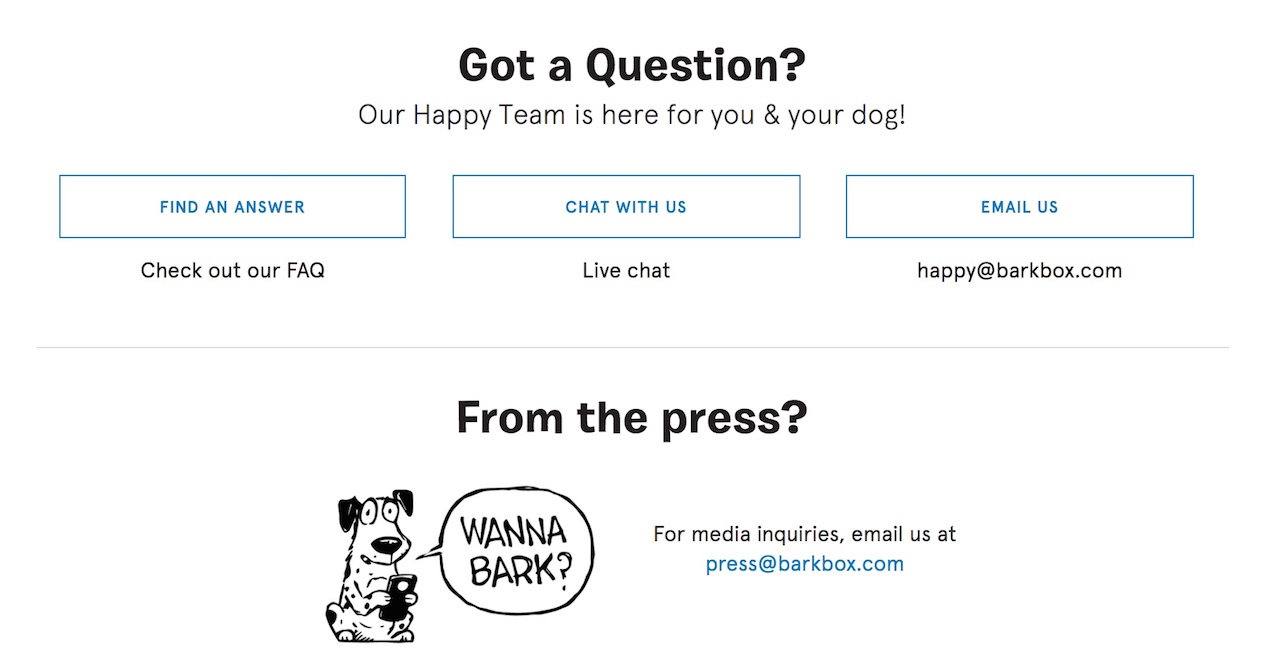
BarkBox’s contact us page is a great example of one that has a simple layout showcasing all the necessary contact information necessary.
They give multiple options to visitors: live chat for emergency enquiries, a general email for questions and a media email for reporters and members of the press.
Best Practices For A Winning Contact Us Page
While every contact page is unique and can’t all be the same, contact pages that get the job done and satisfy visitors all share similar attributes that you can utilize for your own.
These are:
Keeping things simple: Skip any temptation to overcomplicate the page. Visitors come here to contact you in the least amount of time possible, give it to them.
Directing visitors to the relevant contact info: Use subheaders and quick descriptions to direct visitors to the right email or contact info that best suits their enquiry. The last thing you want to do is to direct an urgent customer service request to the general email.
Including at least an email and phone number: As we mentioned before, everyone has their preferences and is more comfortable with a specific communication type. I personally prefer sending enquiries email and if I only see a phone number, I won’t be exactly thrilled!
Allowing visitors to easily locate the page: Your contact page shouldn’t be hard to find. Simply place a link to it at the top of your navigation bar as well as in the footer menu of your website, that’s where most people will search for it.
Showcasing your relevant social media channels: Does your brand have a YouTube channel? Maybe it has an Instagram page instead. Give your visitors an opportunity to discover and engage with your brand on the other platforms.
Customizing the ‘contact us journey’: Every visitor has a unique reason why they are contacting you. Use conditional logic drop-down menus to adapt to what your visitor is looking for. Use your customer persona to craft the right questions to ask them and lead them to the right resource or contact information.
Letting them know what happens next: Whether it is a live chat or an email reply, give your visitors and customers a timeline on when they will hear back from you. Whether it be 24 hours or 10 minutes, they will appreciate it and prevent them from being impatient or uncertain.
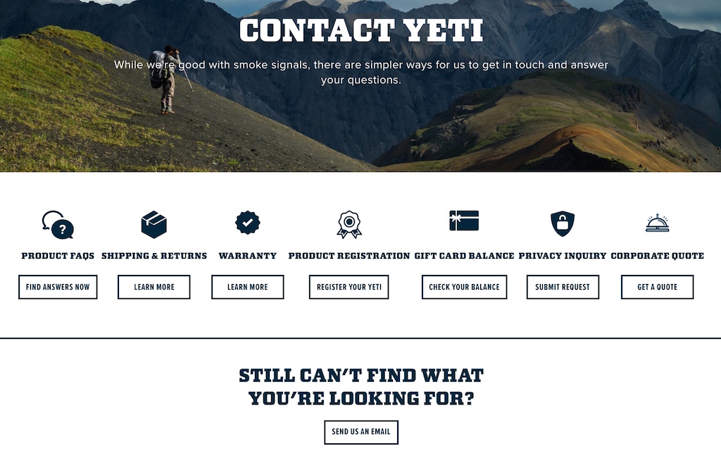
Yeti, a company that sells outdoor drinkware and coolers understands that there are a variety of situations that visitors will contact them on.
They use their contact us page to direct each visitor to the enquiry that they want plus a general email call-to-action button in case it’s just a general query.
How To Optimize Your Contact Form
Ok, so you have decided to use a contact form (smart choice by the way), let’s optimize it for the best user experience possible!
The bare minimum contact fields you’ll need:
1) Name
This is one field you’ll definitely need – You’ll need to know who exactly you are contacting!
2) Email Address
While this is rather obvious, if you are in B2B, you might want to ask specifically for their business address (and not personal emails from Gmail or Yahoo etc). This is to help qualify the enquiry so as ensure you are not wasting time servicing it.
3) Contact number
Collecting the contact number is key, especially if the enquiry turns out to be time-sensitive and critical. In fact, giving your customer a call is actually more preferable to have a conversation to gain more genuine insight for your business and really understand any issue that is happening.
4) Reason For Contacting Us
This can be just a simple open-text paragraph field where your visitor can type in their enquiry in full. Be sure to include this, after all, you’ll want to know why they are contacting you!
3 Optional Fields You Can Include On Your Form
A) Company Name
This is not only important to know the business you are talking to, but it is also great for undercover spy work to know more about this particular customer! Are they a good fit for you? Do they have a need for your product? With their company name, you’ll be able to do some investigation work, allowing you to better serve them with their enquiry.
B) Project Budget
This is especially true if you are in the agency or services business. Not everyone will be able to afford your solution and time is money. If you use your contact us page as a lead generation page, this is one field you can include to help ensure you are speaking to a qualified prospect and how much effort to put in.
C) The Issue Type
Is this a customer service enquiry or is this a sales question about the product cost? This would be a good field to include so that you can send or forward the enquiry to the respective department. Use a drop-down field for this.
Remember, don’t ask for information that you don’t need. Keep things concise!
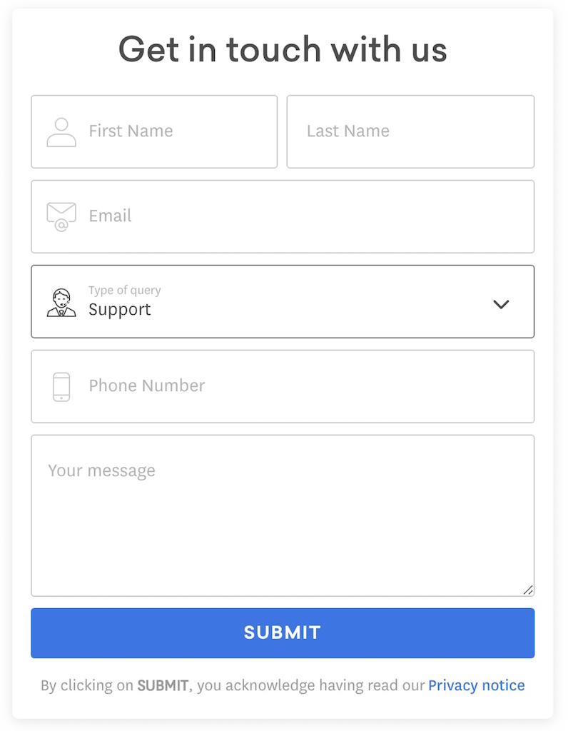
Freshworks keeps their contact form simple and to the point with a quick drop-down field to filter the type of query they will be getting: sales, support or media-related.
21 Fantastic Contact Us Page Examples To Draw Inspiration From
Still wondering how best to craft and angle your contact us page?
We have you covered! Here are 23 of the best contact us pages from businesses ranging from iconic B2C brands to fast-growing B2B companies.
1. Zendesk
Know exactly what your visitor would most likely contact you about? Zendesk does!
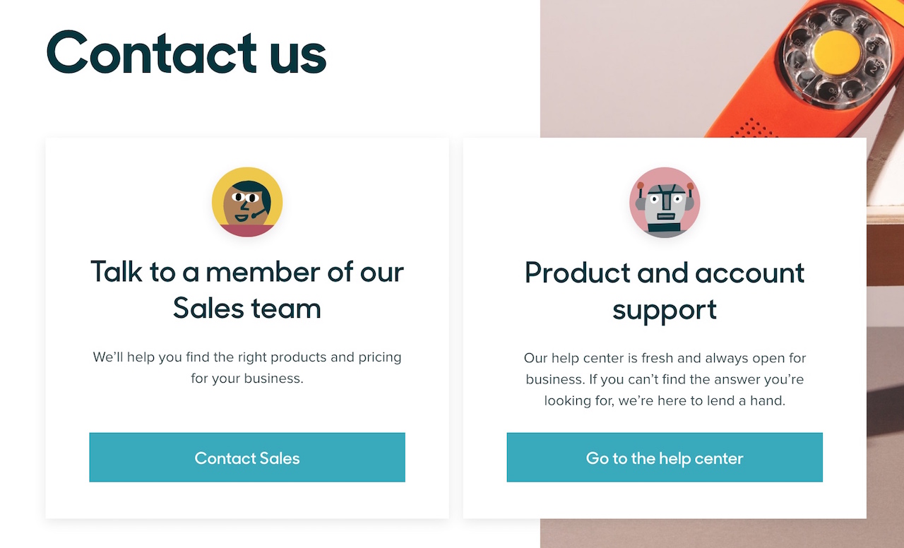
Their contact us page filters queries for customer support to their dedicated support hub while providing a form for visitors keen on learning more about their pricing and services to quickly fill in.
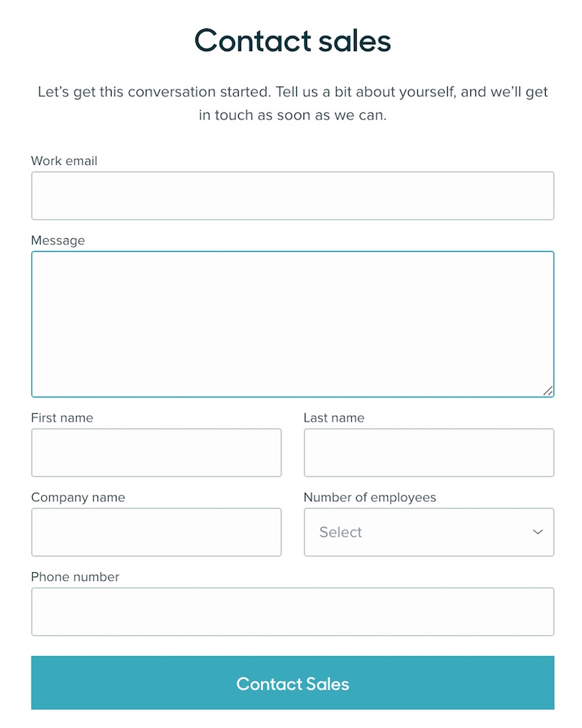
They also keep their form simple and include a ‘number of employees’ dropdown field as well as the ‘company name’ to help filter the incoming sales enquiries so that their sales representatives can do some background checks and recommend the best solution for each prospect.
In addition, Zendesk also keeps their quirky design and illustration consistent on their contact us page with the rest of their website – this is key to give your visitor a great browsing experience.
Takeaways:
– Keep your forms simple and only ask for what you require to better understand the prospect and enquiry.
– You don’t always have to deal with general enquiries if you don’t have the resources. Show the visitors what they can contact you about by restricting their options to contacting you – in Zendesk’s case, only sales or customer support enquiries.
2. VendHq
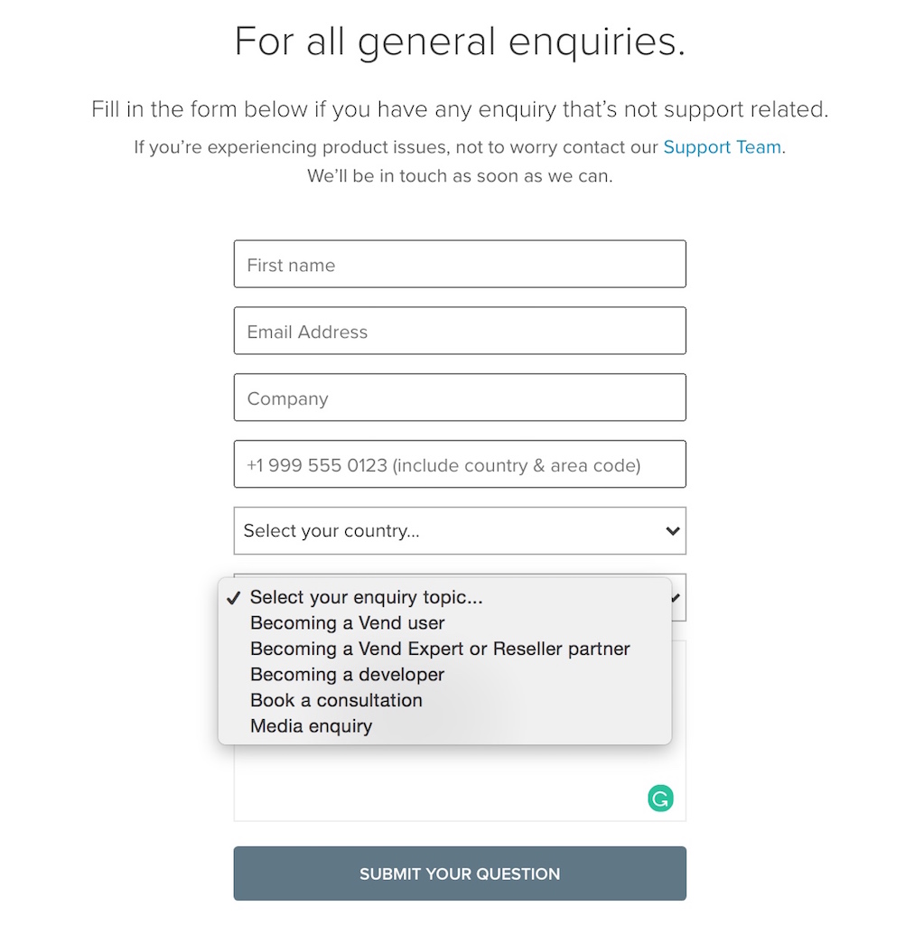
VendHq’s wonderful contact us page acknowledges that their visitors have a wide variety of enquiries that go beyond just customer support and sales.
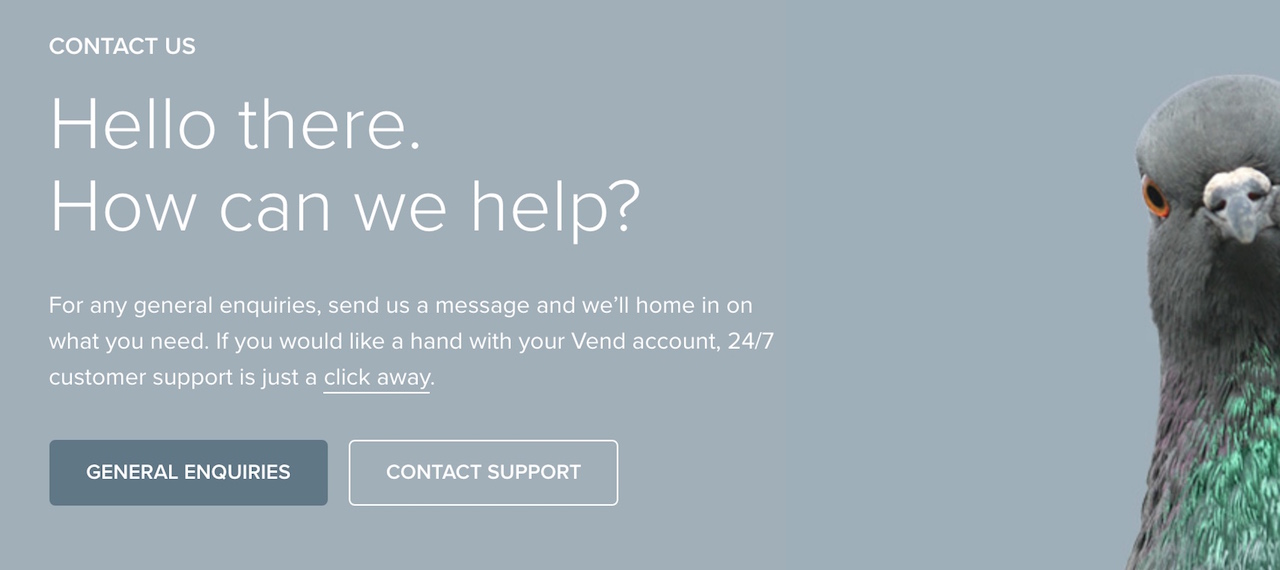
By linking out their ‘Contact Support’ to a dedicated page with a detailed form, they give existing customers the VIP experience to solve their specific issue.
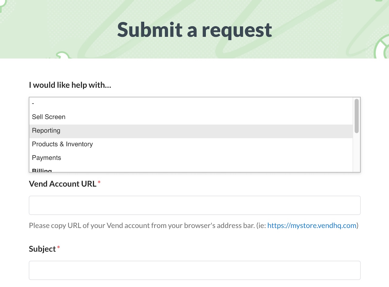
Instead of putting a bunch of different email contacts on their page, they neatly use one single form with a dropdown field that intelligently filters each enquiry to the relevant department to get it handled.
Takeaway:
– You can use a single enquiry form to handle a whole wide range of query types, just make sure you input the right categories (that means knowing the reasons that your customer will most likely contact you about).
3. Basecamp
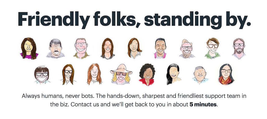
Basecamp’s contact us page is one of the most straightforward and easy to use contact pages out there – as a visitor you will be delighted!
By putting a face on their customer support team, they immediately give visitors a sense of friendliness and familiarity plus they also inform you of how long it will take before you will get a reply!
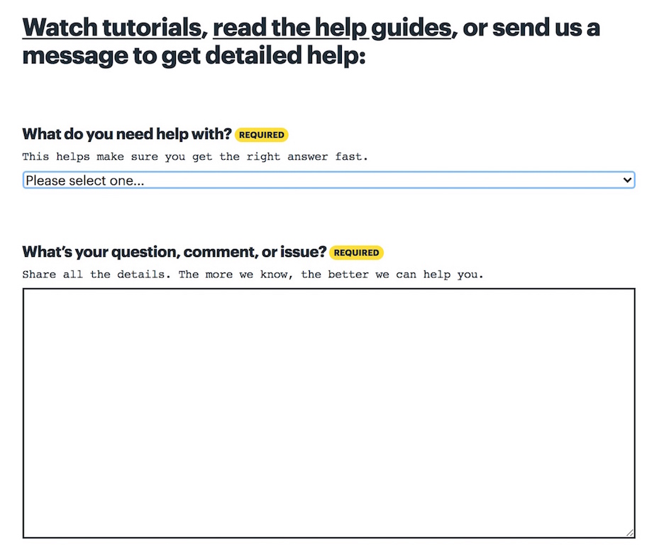
One big issue forms have is not making it obvious which fields are necessary and which are optional, Basecamp helps make this ultra-obvious by highlighting each necessary field with “Required” in bright yellow.
In addition, to encourage proper use of the form such as putting in as much detail as possible to help service the enquiry, they throw in a quick line on why this field is needed and how to best utilize or answer it.
Takeaway:
– If you have an active contact us page or customer support demand, it is a good move to inform your visitor how long it will take for you to get back to them (even if it’s 24 hours, just state it down). It removes any anxiety and impatience and shows that you do care about their query.
4. Slack
Slack’s elegant contact us page uses a single contact form to handle a whole bunch of queries their visitors, prospects and customers might have – but how do they do it effectively?
With conditional logic fields of course!
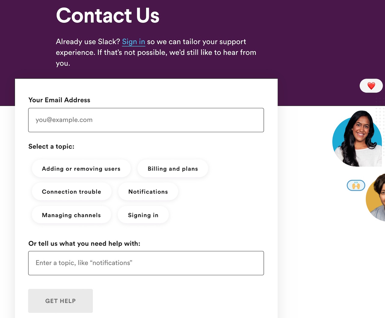
By allowing visitors to select one of the most popular topics showcased or typing in their own, they immediately will know what the enquiry is likely about and will recommend you relevant articles and resources that might help you without going through the form.
And what if they still need tailored help?
They’ll just need to click on the ‘Get Help’ button – after all, the topic or issue they need help with is already captured!
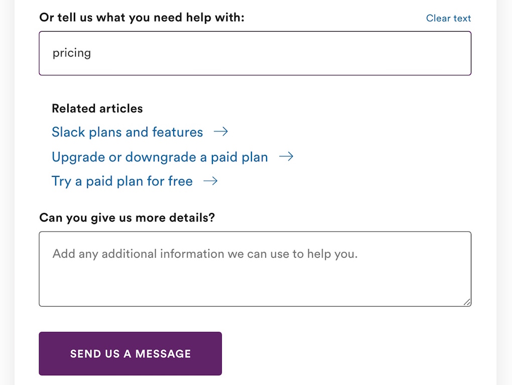
Takeaway:
– Have good programming skills or a team behind you? You can easily create beautiful and intuitive conditional forms that help you (and your prospects) save a bunch of time when it comes to finding answers for questions. Plus it makes your page look neater too!
5. Evernote
Not every contact us page has to be complex, sometimes keeping it simple can be the best way to direct your visitor to the right avenue to leave the enquiry.
Evernote does this well by simply using text and relevant links to direct visitors to where they need to go – nothing fancy, just information and where to go next.
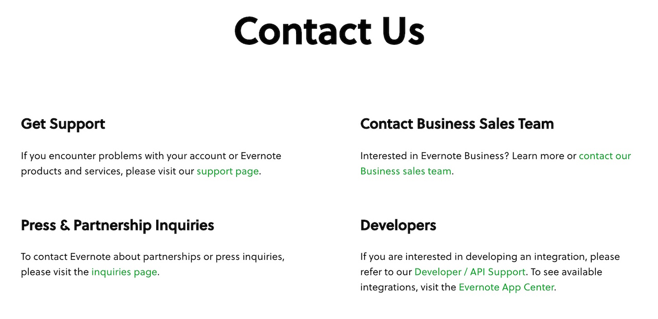
Where are all the forms and email addresses?
They are located in each of the individual pages (contact support, contact business sales etc).
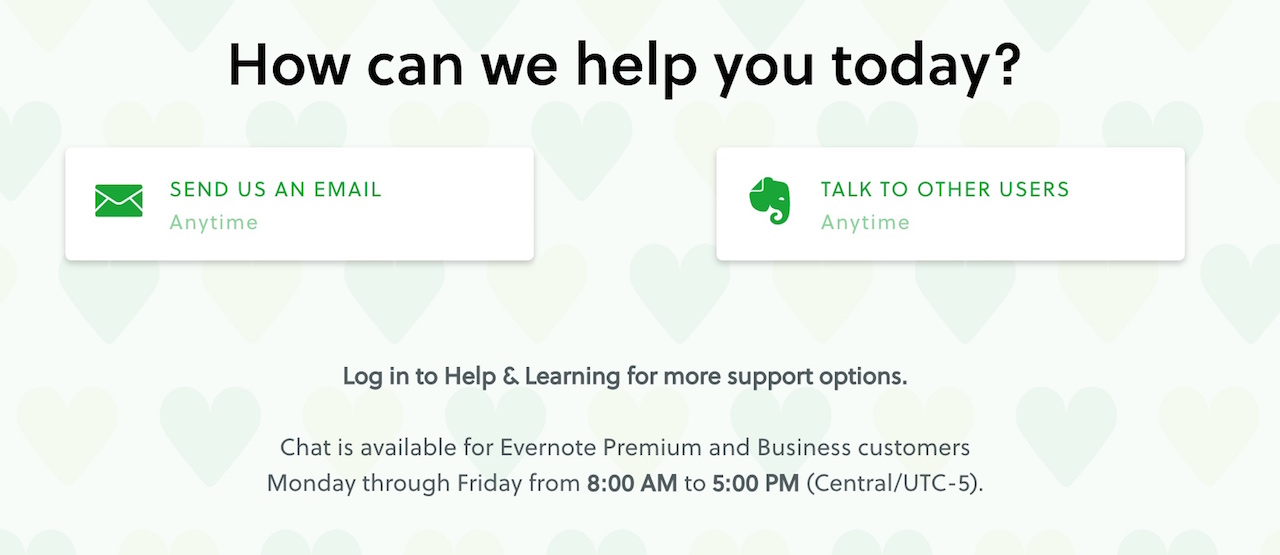
But does this make sense you might ask?
Usually, it is not a good practice, however, if each of the enquiry type (such as customer support), has various other resources such as a forum or some features are exclusive to only paying customers, then it makes sense to locate the contact information or form in another dedicated page.
Takeaway:
– If you have various dedicated contact pages with key information that can’t fit into a single page, use your contact us page as a hub to direct attention to the relevant places. And a great way to do it is to keep things simple and mainly text based.
6. Nextiva
Nextiva’s contact us page is a great example of giving your prospects and customers multiple options to contacting your business.
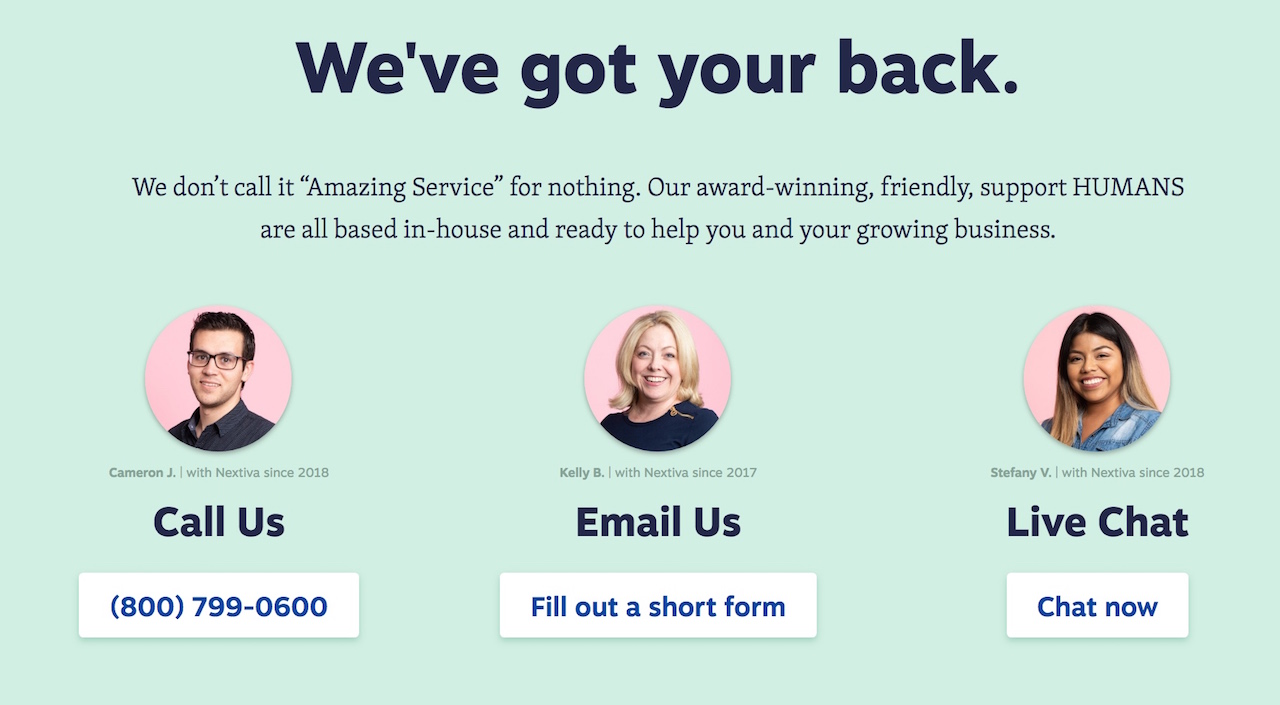
From calling and emailing to even a live chat, visitors can select the avenue that best suits them and how urgent their enquiry is.
What’s more, Nextiva features the customer support team member that is in charge of each contact option, helping to ensure the visitor that their enquiry will be handled by a real-life human being and not just some robot that will spit out a generic response.
Takeaway:
– While you might have various methods for your visitors to contact you, make it obvious for them on how to access it. One great way is to just place them side by side and allow your visitor to choose. Oh yea, if you only have one way to contact you, it’s time to create new options like a live chat.
7. Dollar Shave Club
Dollar Shave Club intelligently utilizes a conditional drop-down menu to get visitors to help learn more and discover solutions on their own – helping both sides to save time and energy, especially if it is just a minor query.
Each question selected brings the user deeper into further questions that will eventually pop-out an answer.
There are pros and cons to this approach, however – you save your customer service team valuable time by knocking out all the easy to answer queries but you risk alienating other serious enquiries by putting up obstacles before they can contact a real-life human being.
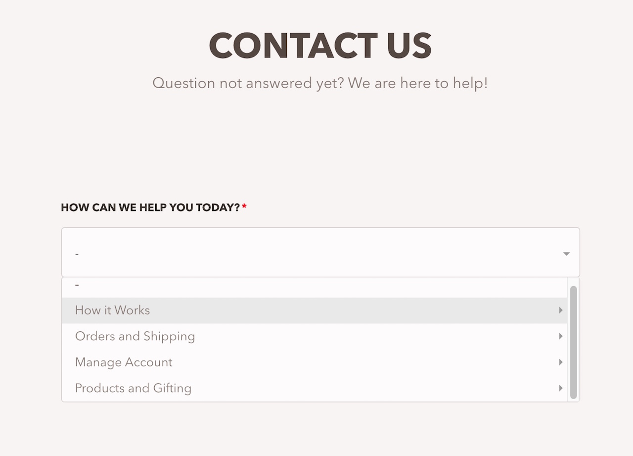
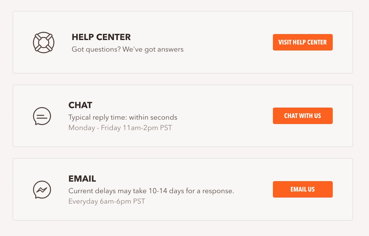
Thankfully at the end, if you still can’t get your answer, Dollar Shave Club takes you to a more traditional contact us sub-page that gives you all the necessary contact details include email and live chat.
Takeaway:
– Allowing your visitors to ‘self-service’ their enquiries can be a double-edged sword. It can save your team valuable time but leave prospects frustrated. If you are running a b2b business where specialised help is most probably needed, this is a bad idea, but if you are selling e-commerce products (like Dollar Shave Club’s razor blades, this could be a viable option.
8. Warby Parker
Warby Parker’s contact us page is a hybrid of both giving visitors options to contact their team directly as well as a selection of frequently asked questions that they answer directly.
Mirroring most effective contact us pages, they give 3 common contact options to visitors to reach their brand – email, phone call or live chat.
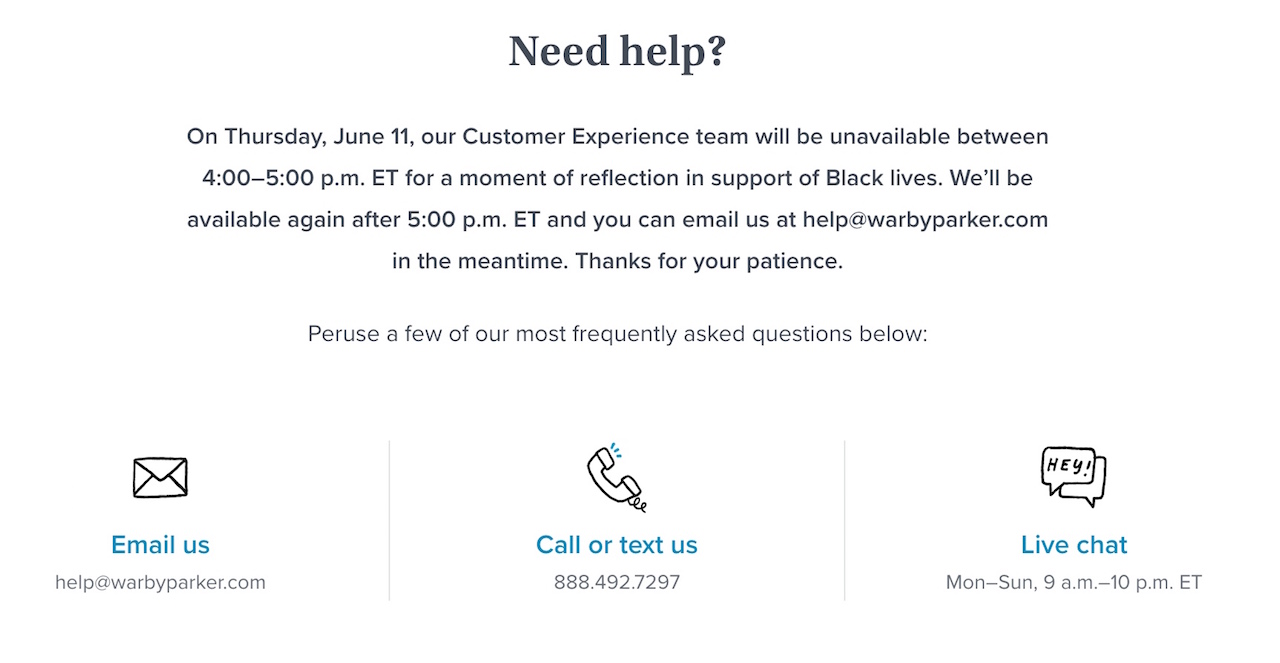
One thing to note is if your brand will be uncontactable for whatever reason (a pandemic, a social cause or a company anniversary), take this opportunity to address it in your contact us page, like how Warby Parker did, and give details about when your company will resume communications with the public.
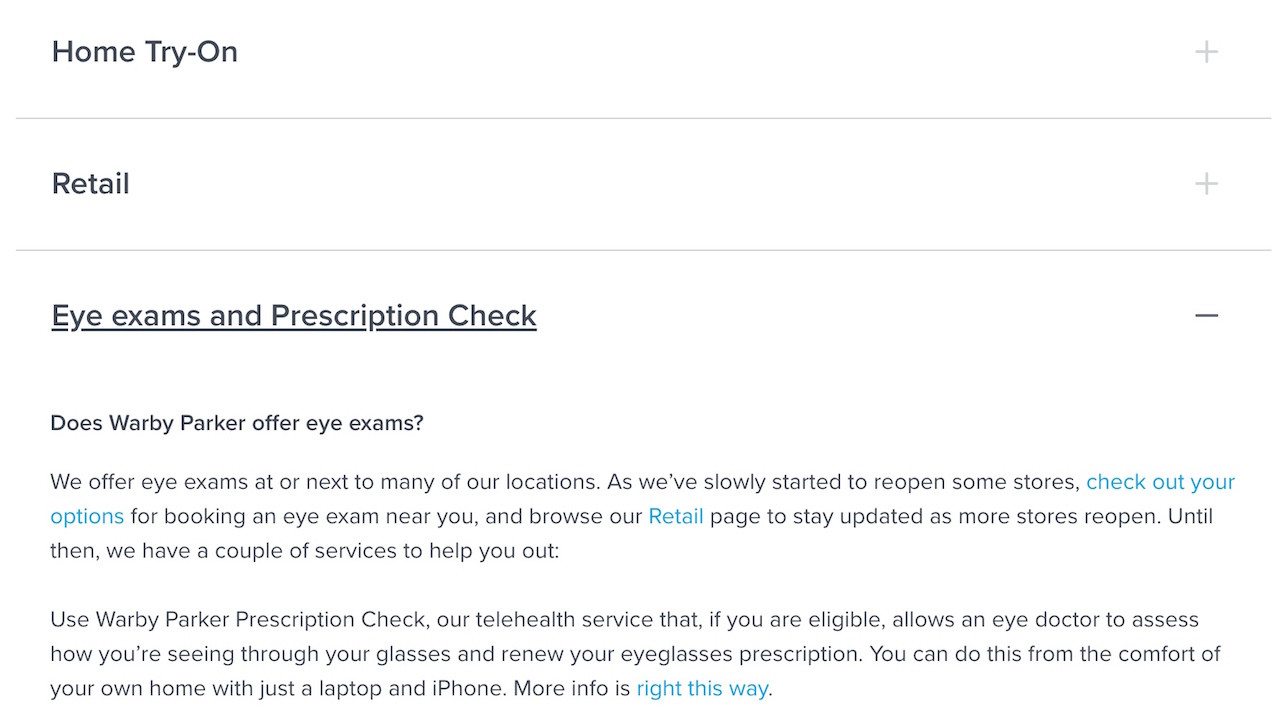
In addition, the answers they give on the commonly asked questions section below isn’t just some generic answer or a link to some help center, they answer it in detail.
Takeaway:
– The hybrid option of giving contact options and answering frequently asked questions is a great way to craft your contact us page. Just sit down with your sales and customer team to decide on the issues that constantly pop up and address them on your page.
9. Hootsuite
One look at Hootsuite’s contact us page and you’ll quickly realise that sales is their top priority here and they have a real comprehensive form to qualify and filter the potential sales enquiries.
If you are selling a range of solutions that is complex and caters to various persona types, having a detailed form makes sense.
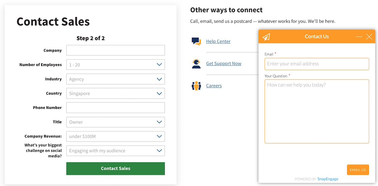
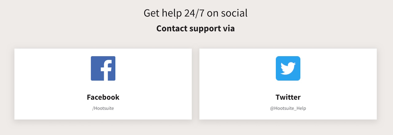
Although they provide an avenue for visitors to email their team with yet another form, sometimes people want a more instant connection at any time of the day.
Hootsuite addresses this by showcasing the various social media platforms that prospects can engage with, ask their questions and get answered.
Takeaway:
– Social channels aren’t just platforms to push out your content, you can also effectively use them as customer support avenues for your visitors to get their issues known and get answers. Plus it helps to show the whole world you have a robust customer support team too!
10. Monday
Let’s say you just launched your start-up last month and need to scrape together a contact us page fast – how do you do it?
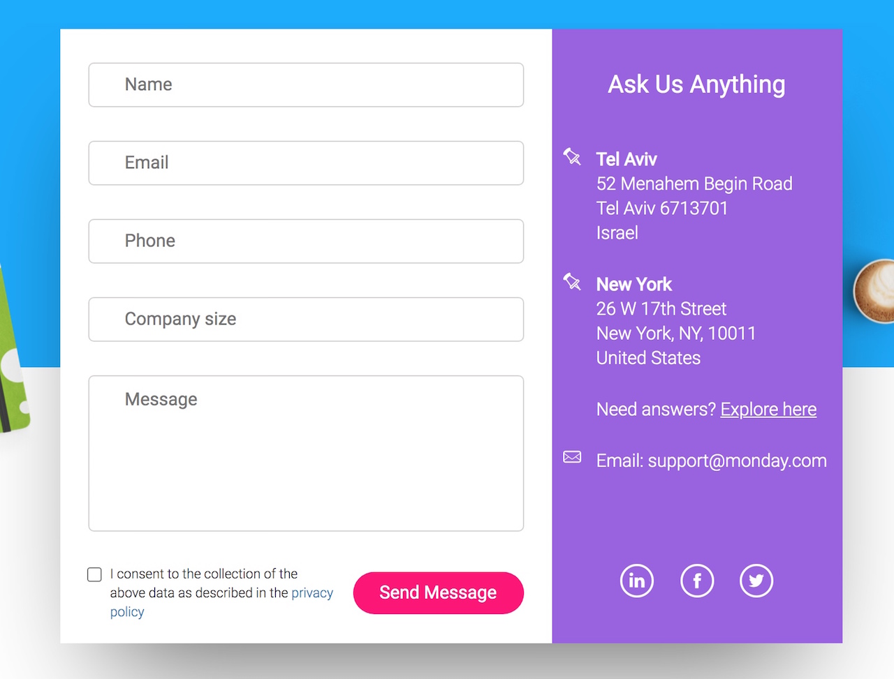
Just take inspiration from Monday’s no-frills contact us page. It’s just simply a form for enquiries about virtually anything.
They include all the bare essentials such as an address, email address contact point as well as links to their social platforms.
And oh, they are a billion-dollar company so if it works for them, it might work for you too!
Takeaway:
– Sometimes your priority might lie in your sales pages or your customer support but you will still need to have an effective contact us page. Just include all the minimum necessary contact details and avenues to make it effective – and sometimes simplicity works much better than having a complex and flashy page.
11. Stripe
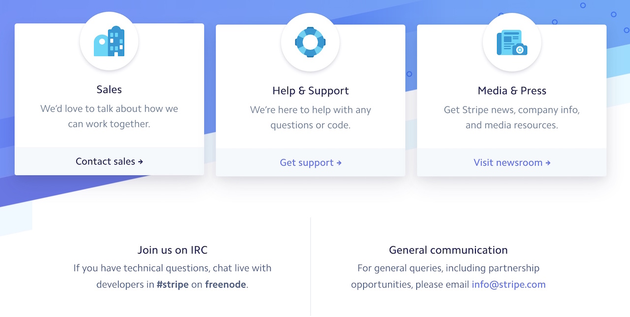
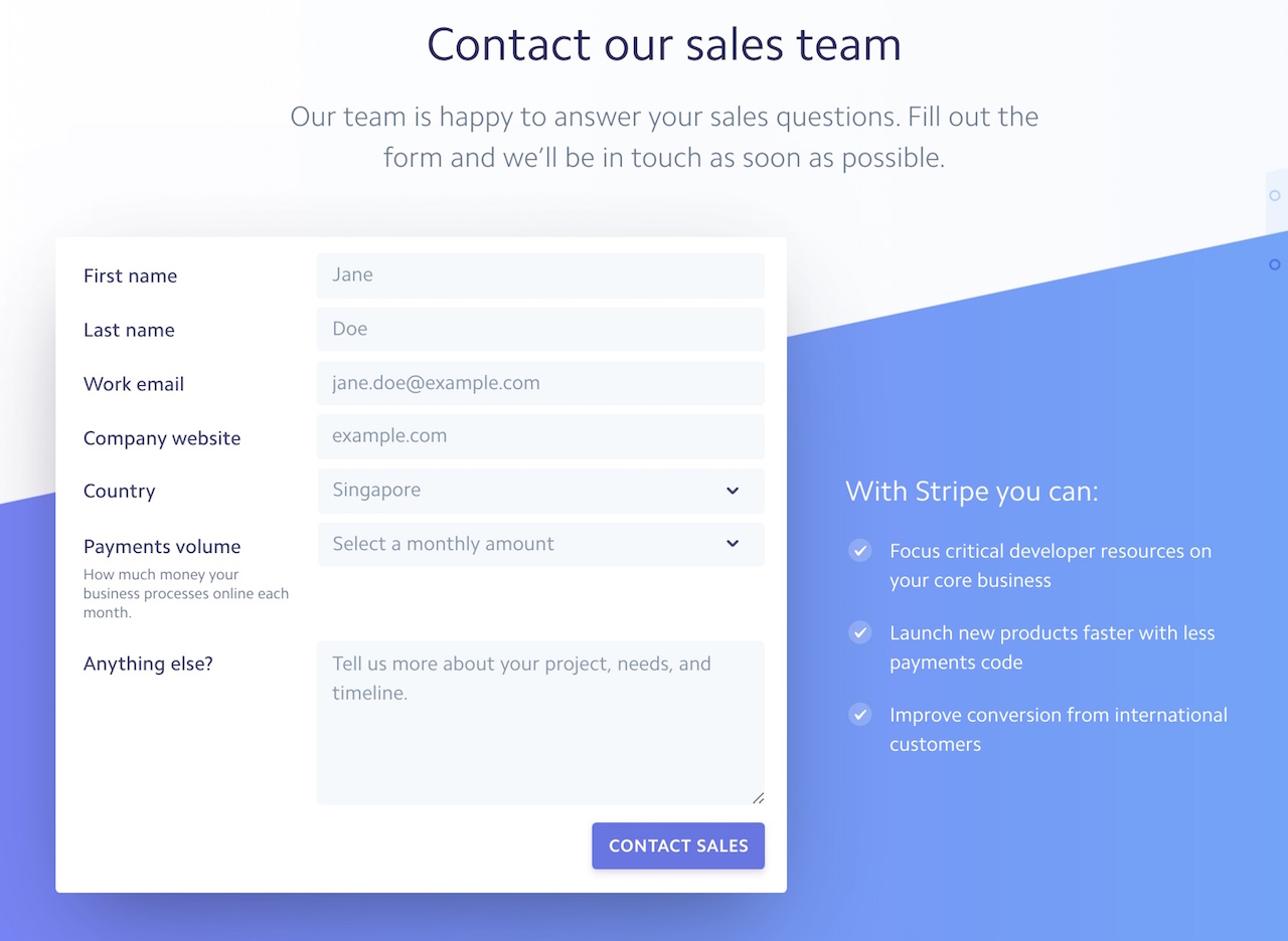
The first thing about Stripe’s contact us page is the clean and crisp design that makes it a treat for the eyes and how easy it is to find the right point to contact for your query.
In fact, by understanding their customers aren’t just end-users but developers as well, they give their more technical audience a highly relevant outreach channel on freenode, a platform their technical audience frequently uses.
This makes it highly convenient and easy.
In their contact us sub-page form, they intelligently list out the benefits of what Stripe can do to spur their prospects to take action and send in that sales enquiry.
Takeaways:
– While you can use social proof and list down benefits and features of your solution, you need to use them tactically where they are useful. Does it make sense to use them on a contact sales page? Yes. Is it good to do so on a general enquiry page? No.
12. Bluehost
As a website hosting business, the main reason why anyone would get in touch with them would be to handle technical and urgent issues such as customer websites crashing or going down.
Bluehost knows this well and the first thing they showcase is an instant live chat or a number to call their helpdesk.
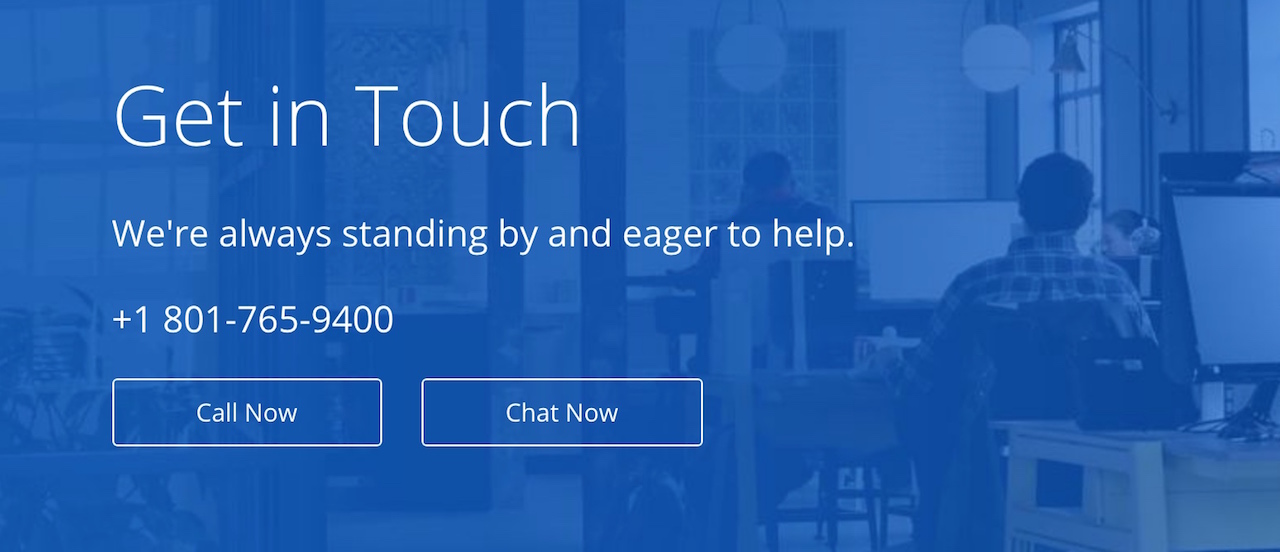
They locate the rest of their contact points towards the bottom of the page and address the biggest issues first and give priority to their customers facing problems with their service.
Takeaway:
– Your contact us page isn’t just for the public and new visitors to contact you. If you’re in a competitive space where you have recurring customers, you can prioritize the contact points to the group of people you want to help the most.
13. MailChimp
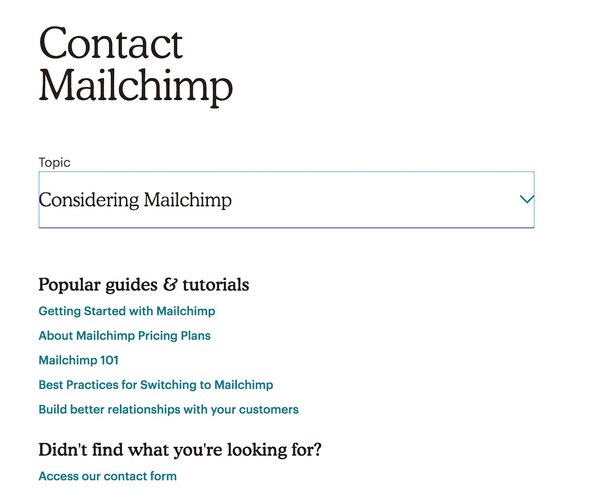
MailChimp keeps their contact us page simple with a conditional drop-down menu that directs visitors to the right resources for the topic that they have a question about.
This self-help menu is getting popular amongst many Saas companies and would be even better had they included a few direct contact options such as a hotline or a live chat.
Takeaway:
– If you have been creating content and have guides, you can (and should) integrate them into your contact us page. A great way is to emulate Mailchimp’s page and showcase the relevant guides to your visitors that ask on specific topics.
14. SEMrush
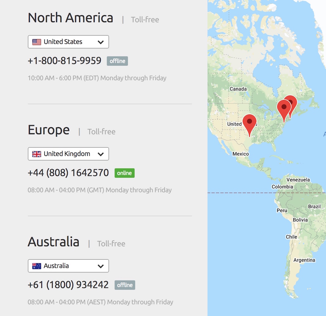
If you are running a business that has customers all over the world, it will be smart to have the local support teams handle each specific region or country that your customers are in.
Not only because it is better time-zone wise for both your team and visitors, but there are also many local issues and situations that are best handled by people in that particular region.
And if your business can afford it, making your numbers toll-free will help you get more enquiries and calls easily as your prospects making the call will incur no out-going call charges.
Takeaway:
– Phone calls are one of the best ways to get feedback from your customers but sometimes the time-zone could cause issues. So localise your phone call options and give your visitors a chance to contact your local team in their country.
15. Tiffany & Co
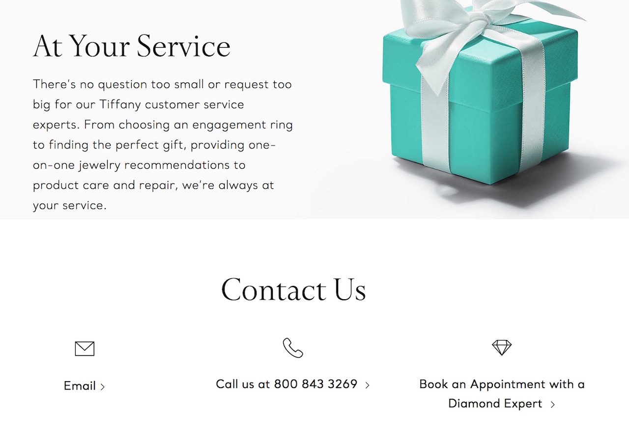
Showcasing your brand values and personality doesn’t just stop at your product or about us page, great copywriting should be also included in your contact us page.
Tiffany & Co does this well with the copy on their contact us page, highlighting how willing they are to service and please their customers on their requests.
This approach is sincere and makes customers feel special and valued – exactly what they want their high paying customers to experience.
Takeaway:
– One of the best ways to maintain your brand experience throughout your website is through the copywriting on the page. Remember to keep the tone of voice consistent in your contact us page and inject what makes your brand memorable. It couldn’t be an exclusive feel or even humor and jokes.
16. Microsoft
Ah yes, the power of artificial intelligence and chatbots taken to the extreme is how Microsoft handles enquiries in their contact us page.
This intelligent chatbot allows visitors to literally type in any question or statement that they want (even with spelling and grammar errors) and get suggestions on what they might want or specific instructions to what to do next.
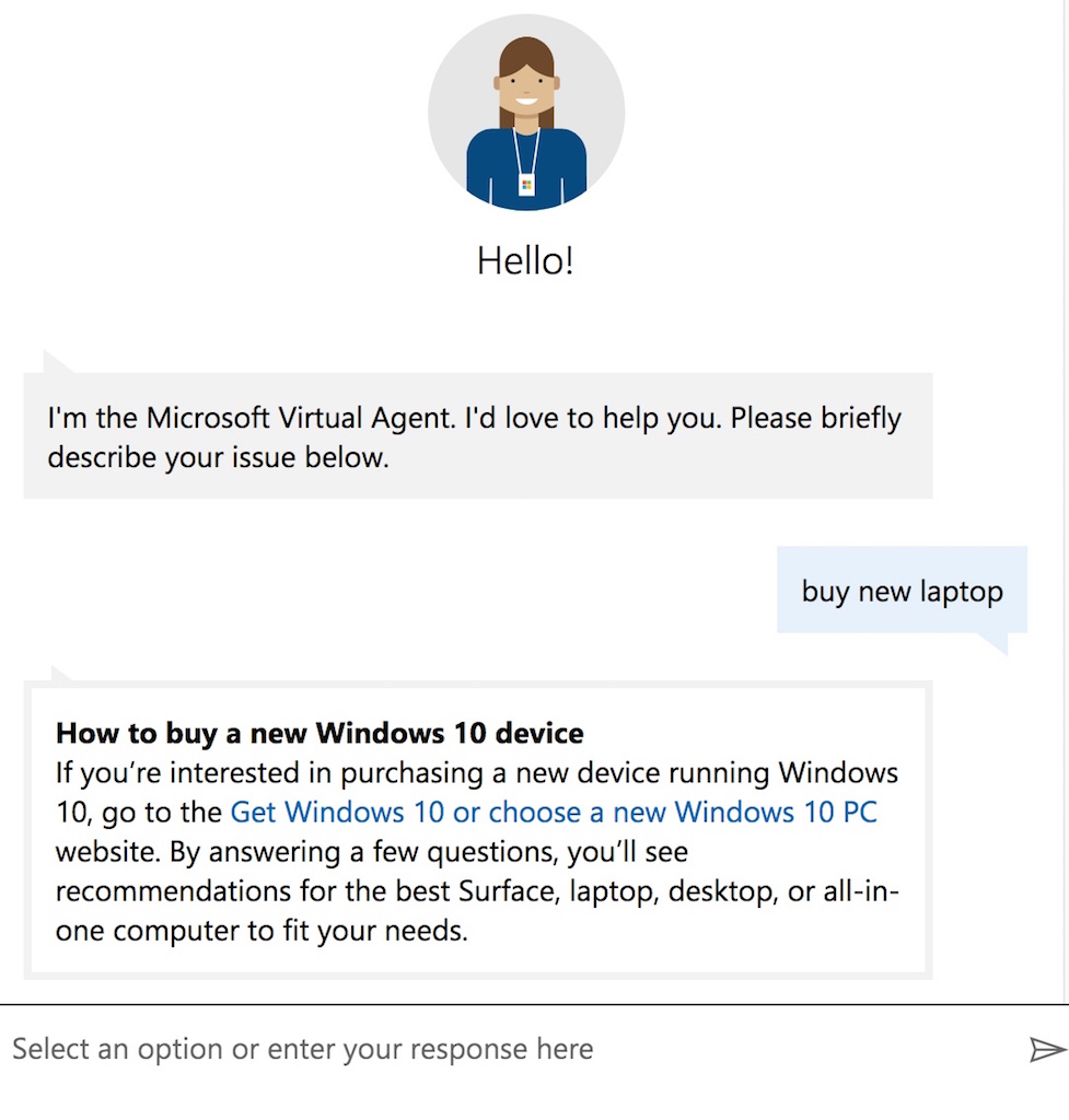
While this might seem like a good idea, cool and a rather intuitive solution to contact us pages, we would only recommend this to companies that are very tech-savvy and have a ton of resources to code such a feature.
Takeaway:
– While you don’t need to have artificial intelligence on your end, chatbots are fast taking over the first few interactions with your visitors. Here’s a handy guide on how to effectively use chatbots to handle enquiries.
17. Hubspot
While many contact us pages account for visitors contacting them through email or a chat, there could be times where customers would like to visit your office premises physically.
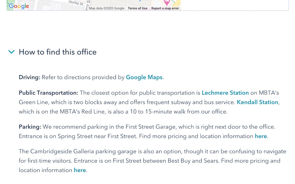
Hubspot understands that sometimes customers would like a physical meeting to make contact and depending on your location, it could be hard for them to locate your office – especially if it is right smack in the middle of a city.
Their contact us page handles this very well by giving clear directions as well as a Google Map to help any potential visitors reach their office safe and sound.
Takeaway:
– If your business has a physical office and it is important for your prospects to visit you (such as real estate, co-working spaces, banking services etc), make it easy for them to get to you. Throw in a Google Map marker to your website as well as detailed directions – make it impossible for them not to locate you!
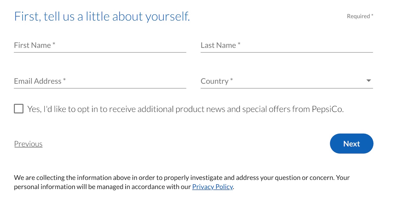
18. Pepsi
When it comes to contact us pages, Pepsi makes it easy for the everyday visitor to locate the right avenue to contact the brand with their particular issue.
One great way they do it is to use very lay-man language making their brand highly approachable.
This categorization also allows them to collect all feedback into specific buckets where they can push to their product development teams, their customer support staff as well as their sales team.
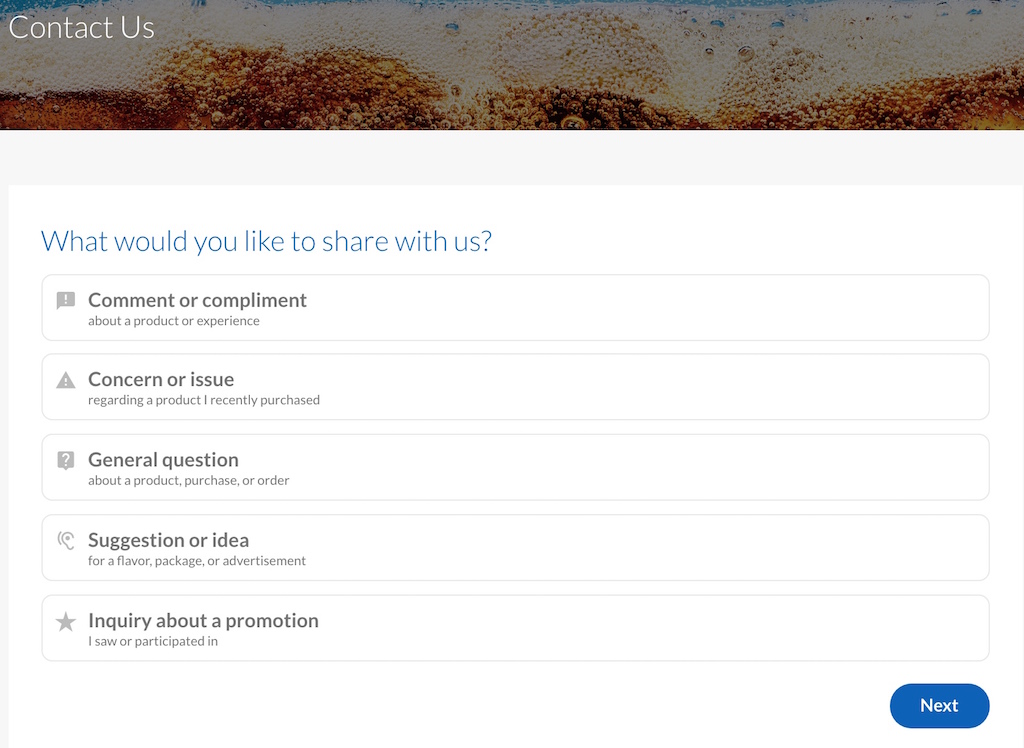
In addition to this, Pepsi actually entices feedback givers to sign-up for their newsletter and get their email list by dangling the promise of special offers. Brilliant!
Takeaway:
– If you are building an email list and want to keep top of mind to your visitors or even nurture them into customers, your contact us page can be a great tool to accomplish this. Just make sure that they opt-in by including a checkbox and not just automatically assume they would welcome your marketing materials unsolicited.
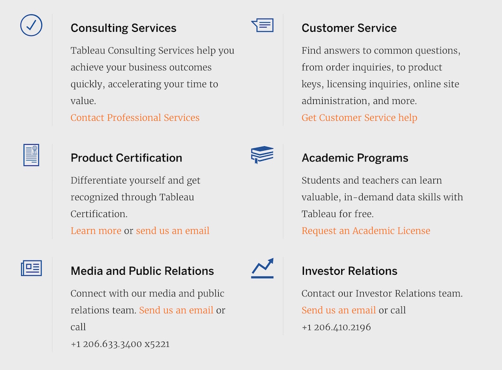
19. Tableau
As a listed company, there will be a multitude of reasons why website visitors would want to visit you.
Some could be investors, others are current customers that need technical support to members of the press that are looking for information for their publication.
Tableau addresses all of these needs by using a content format that is commonly found in product pages.
Their headers and quick descriptions concisely convey enough information to the visitor to direct them to the right avenue.
Takeaway:
– If you have many moving parts in your business, writing a short description under each contact avenue would be helpful for your visitors to get to the right contact point. You don’t want your general enquiry email to be flooded with requests from investors!
20. McDonald’s
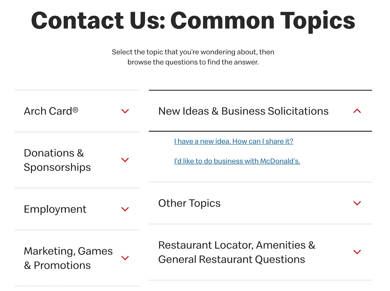
McDonald’s turned their contact us page into a kind of a FAQ menu.
While being such an iconic brand, McDonald’s understands the beauty of keeping things simple and addresses a selection of commonly asked questions people will have on their brand.
And you can do the same for your own contact us page! Just bring attention to the most popular questions asked and you will be able to address the bulk of your potential enquiries.
Takeaway:
– Unlike an actual FAQ page, you don’t need to include long text to address the issue outright, just link to the right resource on your website to get it handled. This allows your visitor not to get overwhelmed as well as allows you to address more topics and questions.
21. Marcus (by Goldman Sachs)
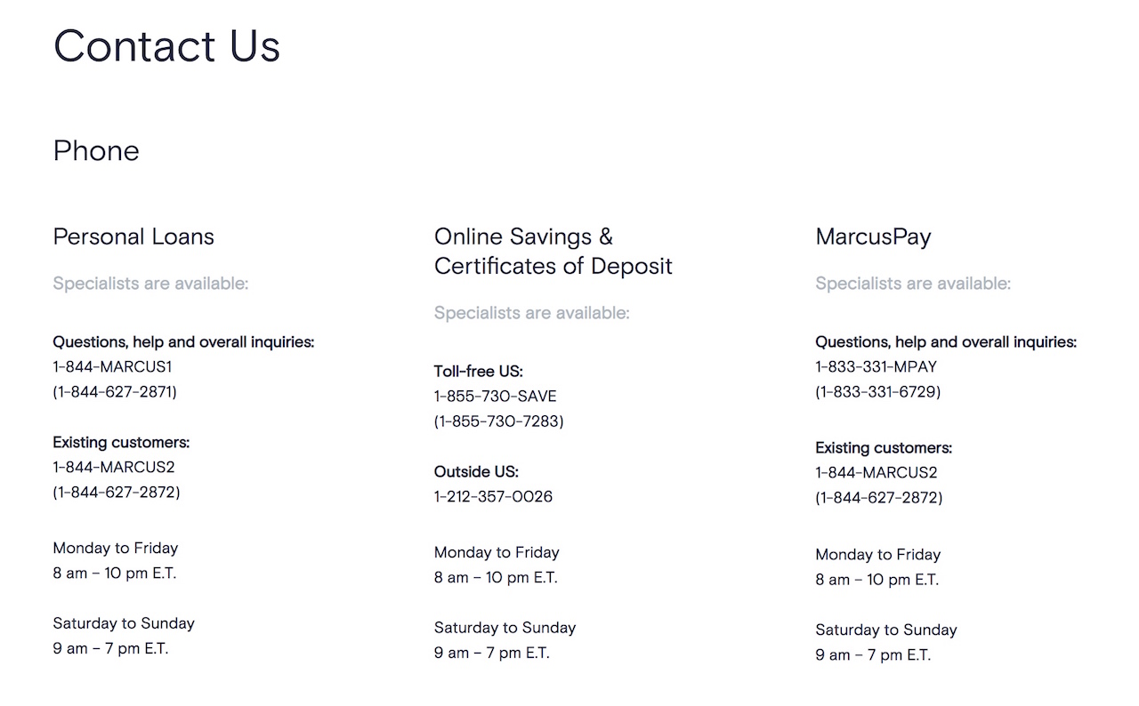
Sometimes it pays to control the entire conversation with your visitors on your contact us page.
That means severely restricting the ways they can reach you and that is exactly what Marcus (a digital bank) does on their contact us page.
They do not have a live chat, no chatbots, no emails, just simply dedicated phone lines that connect visitors with enquiries (specific ones at that) to their department specialists.
But why do they do this?
Well, banking is a highly personal, competitive and sensitive industry and having a human touch, no matter how slow or inefficient, is one of the best ways to get a prospect comfortable enough to become a banking customer.
Takeaway:
– This is one of the riskiest ways to craft your contact us page and requires you to fully know your industry and customer needs. But if you manage to nail it, it will pay you huge dividends! Ask yourself, “what purpose am I mainly tackling (customer support, sales etc) and which channel makes it the most comfortable for my prospect to become a customer?”
Bonus: Don’t Bother With A Contact Us Page & Jump Directly Into The Conversation!
Wait what? Isn’t this entire mega post all about how to write a contact us page?
Yes, it is, but let’s take a step back.
What exactly is the purpose of a contact us page?
It is to address questions and queries your visitor might have and one of the best ways to do it is by getting into a conversation with them.
Ahrefs does this well by having an instant messenger chat throughout their entire website with a dedicated team of staff that is literally on call.
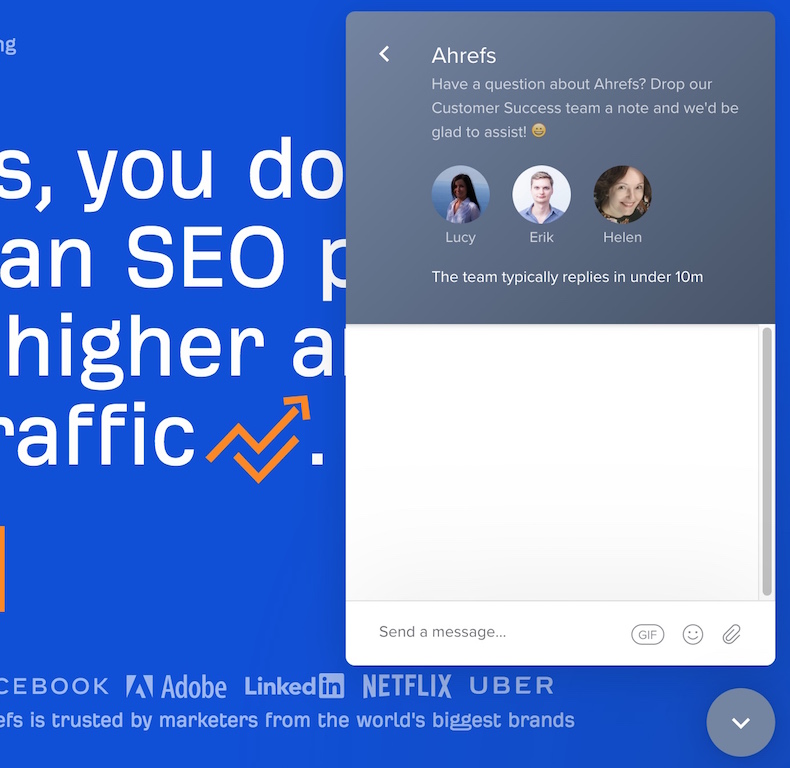
In fact, if you click on their ‘Contact Us’ link at their website footer, it pops out this chat!
If you have a team of customer support rock-stars, you can afford to break the trend and handle their needs.
However, your team will need to have a broad range of problem-solving skills in order to handle any unique or weird situations that might get thrown their way.
It’s Time To Craft Your Very Own Contact Us Page
Crafting or revamping your contact us page doesn’t have to be hard, just follow the best practices we outlined earlier and keep your visitor’s user experience at the forefront.
Whether you are looking to make your page as informational as possible or just bare-bones essential, always ask yourself “Will my page help my customers solve their queries and does it help fulfil my business objectives?”
And if your contact us page does both, you have a winner on your hands.
If you need help with crafting one – we are here to help! Just contact us here and we’ll be in touch.
Seen a cool contact us page that I should know about?
Email me at sean@speechsilver.com, I’d love to hear from you!

