UX Copywriting: What You Need To Know (Examples Included!)
August 5, 2020 | Sean Foo
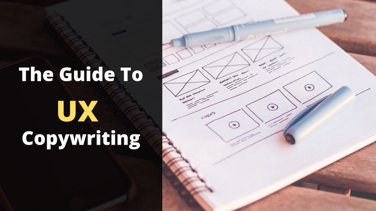
User Experience (UX) is about understanding the user’s journey and helping the user to reach their goals.
UX Copywriting uses words to help users do so.
Unlike usual copywriting, UX copywriting does not aim to solely drive actions like sales or sign-ups.
Instead, it aims to help users navigate better through a mobile app, software, or a webpage!
Great UX copy enhances users’ interactions with your offerings.
This makes them trust and stay loyal to your brand and more importantly take the correct action that will, in fact, boost your sales and growth!
So what are some elements it uses to do so?
Key Element #1: Headlines
Headlines tell users what the page is about.
Afterall, this article’s headline was what got you interested to click on this article!
Great headlines pinpoint the benefits of reading the article, so users can decide if reading the article is worth their time and effort – instantly.
Other UX copy like subtitles or table of contents may also accompany it, to give users further ideas about what the article is about.
Let’s look at how Close’s blog does this.
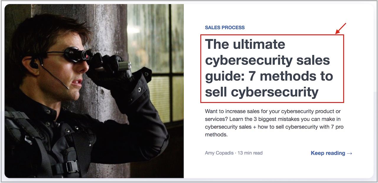
When users arrive at Close’s blog, they are greeted by the articles available.
For each article, a big, bolded headline is shown.
The headline tells users what to expect from it.
In this case, the headline tells us that:
- “The ultimate” – Users don’t have to read other guides to learn more!
- “cybersecurity sales guide” – What the guide teaches.
- “7 methods” – Being specific gives users more certainty that the article isn’t filled with garble that they won’t understand.
So if it’s the right fit, users will feel more certain that this article would be worth their time reading.
What if they still feel unsure if the article will help them?
That’s where the other UX copy comes in!
Above the headline, the blue “Sales Process” tells users what the article is about.
The subtitles below further explain what the article is about.
“13 min read” tells users how much time they would spend reading the article.
And should users take the leap and click “Keep reading”…
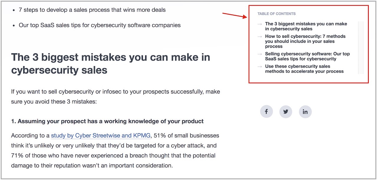
The table of content on the right of the page:
- Tells users what the article will explore
- Let users know how far they have read
So that users won’t feel lost at any point as well as jump directly to the main sections of the article (an awesome UX shortcut!).
Key Element #2: Call-To-Action Buttons
Even the small Call-To-Action (CTA) buttons you click on contains UX copy.
Since the wordings used are so short, they are called “micro-copy”.
These short wordings may seem inconsequential but…
Don’t be fooled!
You can inject powerful elements of persuasion into your UX copy when writing for your CTA buttons.
Just changing one word from “Start your free 30-day trial” to “Start my free 30-day trial” can increase click-through rates by 90%!
Even the placement matters too.
Shifting your CTA below the page can increase your click-through rate by 304%!
Impressed?
Basecamp’s home page shows an example.
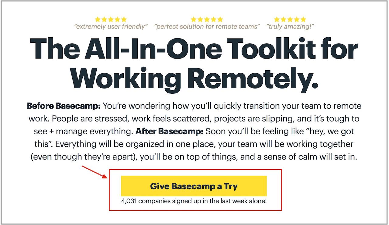
While the headline and subtitles share what Basecamp is about, it might not be enough to spur action.
When it comes to taking action, users will naturally feel hesitant trying Basecamp still!
That’s why “Give Basecamp a Try” is used for the Call-To-Action.
“Give Basecamp a Try” feels less committal and pressurizing than “Try Basecamp Today” or even worse “Sign-up For Basecamp Now”
This eases the audience’s fears that they may make the wrong decision and makes them feel more ready to act.
To further ease their fears, the short text below,
“3,928 companies signed up in the last week alone!”
Uses social proof to show users that:
- Basecamp has been tried-and-tested
- Others have also taken the leap before
Of course, some users may still not feel ready to “try” yet so…
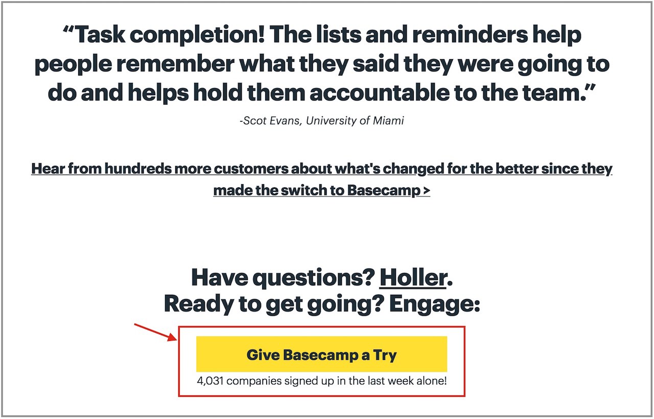
After bombarding users with tons more copy and testimonials, Basecamp pitches to users again.
(Remember the point about placing your Call-To-Action below?)
This way, users are more likely to click-through and try Basecamp given they feel more certain now!
Key Element #3: Navigation Bars
Navigation bars give users options to explore the site with and is where the art of UX copywriting comes into play.
If you’re on desktop, see the top of your page?
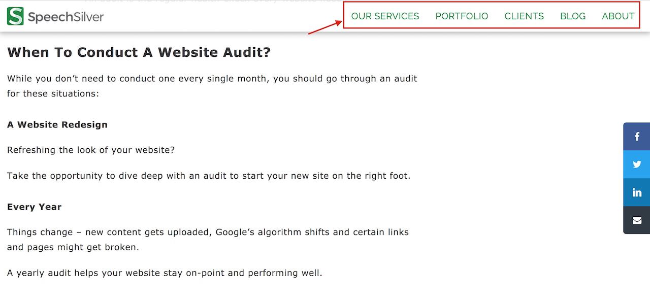
That’s the navigation bar for SpeechSilver, where you can explore more about us and what we do!
Navigation bars typically allow users to scan through available options quickly, through simple wordings.
The copy here has to be quick, concise and informative, allowing readers to immediately know where to go and what to expect.
Some navigation bars also offer drop-down menus to help users explore further what pages are available, through what’s called “breadcrumb navigation”.
JustInMind’s navigation bar shows how.
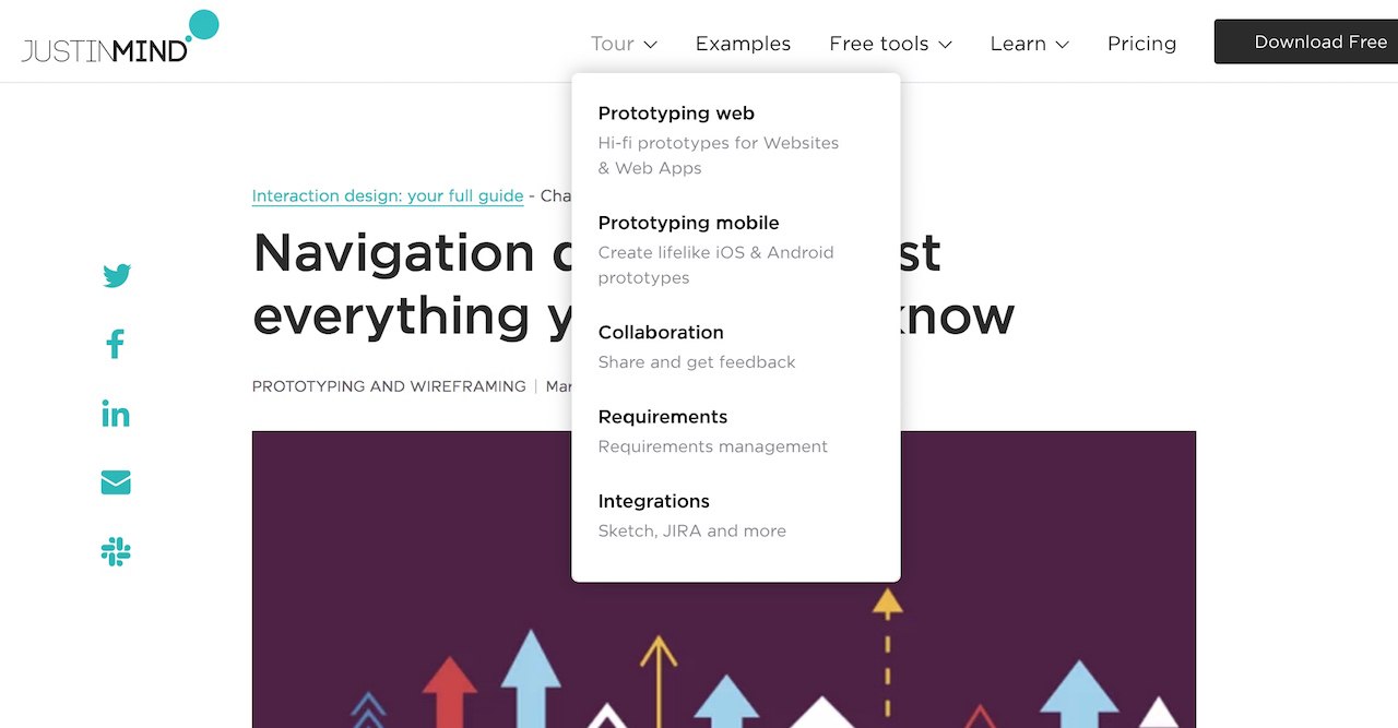
When users hover over “Tour”, a drop-down sub-menu is shown.
Each item in the sub-menu may not make sense to users immediately, so grey-ed out subtitles explain each item further should users want to find out more.
The same thing happens should users hover over “Free tools” and “Learn”.
The UX copywriting here allows users to learn what they can explore in JustInMind’s website and to select where to explore next through quick informative descriptions.
The 4 Major Platforms That Needs Effective UX Copywriting
Effective UX copy understands where you are at in your journey, and guides you to your next step – perhaps even without you noticing!
Your web experience, of course, is not limited to just articles, you may browse apps, videos, and all sort of other platforms.
What’s more, different platforms use UX copy elements differently.
So what are the major platforms you may browse, and how does each use UX copy elements?
Major Platform #1: Mobile Apps
We’re not sure how often you use yours, but people spend 3 hours and 15 minutes daily browsing on their phones on average.
That’s a lot of time spent browsing on our phones!
Most of the time, we’re using an app on our phones – messaging apps, web browsers… etc.
UX copywriting is crucial to make that app experience smooth, ensuring greater use time and fewer people deleting the apps.
Let’s take the Blinkist app for instance.
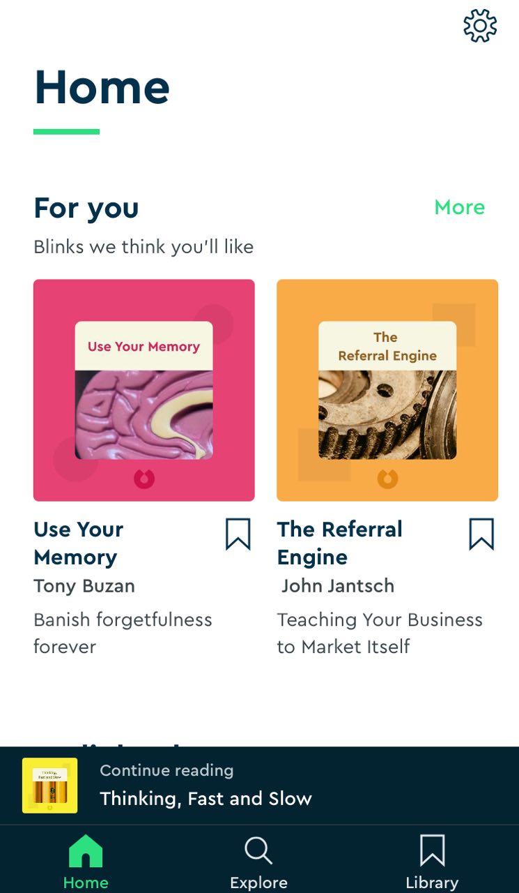
At a glance, you know what options are available.
You can:
- Browse the home page for “Blink” recommendations
- Continue reading the previous “Blink”
- Search for a “Blink” you were thinking of
- Or browse past “Blinks” that you’ve saved
(For Blinkist, a “Blink” is a book summary.)
Unsure what each “Blink” recommendation is about?
Short sub-texts like “Banish forgetfulness forever” tells you what to expect!
Or you can explore and change the app settings in the top-right corner button if you so wish to.
You understand all these without having to think too much…
…which is the whole point of UX copywriting!
UX copywriting helps you navigate the app smoothly, so you get the most out of the app.
Major Platform #2: Landing Pages
When you’re browsing your Facebook feed or Google results, you might come across ads.
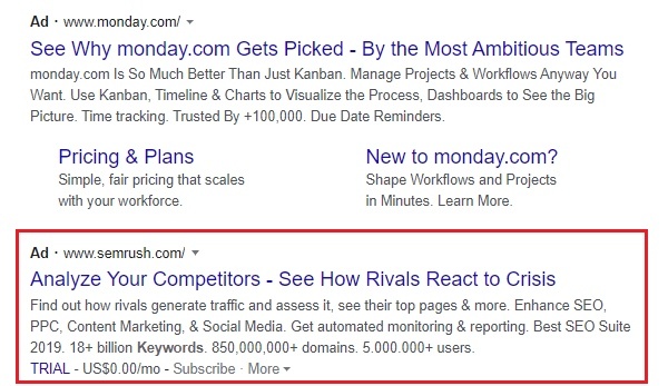
Maybe, you get curious enough to click on one.

And you end up here.
The page’s headline “Crisis-Proof Competitive Research” aligns with what the ad’s headline promised – “Analyze Your Competitors” and see how they “React to Crisis”.
You feel reassured you’ve landed on the right page – due to “message match”.
You’re curious about what SEMrush is about, so you continue browsing.
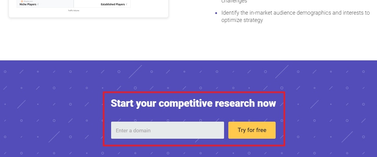
While the page shares about SEMrush’s benefits, you can’t help but notice a form and “Try for free” Call-To-Action button over…
And over…
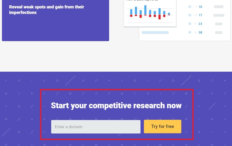
Again.
And another strange thing about the page:
It doesn’t have a navigation bar!
This is an intentional UX design choice most smart landing pages employ.
So you realize your attention was focused on what SEMrush is about throughout, with only one “escape route”…
…which is to fill the “Enter a domain” form, and click on the Call-To-Action!
It’s ”free” anyway, right?
These are how UX copy predicts the user’s journey, and plant relevant elements along the way.
The headline and page layout match what users expect from the ad – through “message match”.
The same Call-To-Action button is repeated throughout the page, so users are increasingly likely to click on one.
While navigational bars are removed to keep users on the page.
This helps the landing page do what it does – drive users to an action!
Major Platform #3: Website Homepage
You saw a website you’re curious about – and decided to explore more and visit their homepage.
Like Unbounce.
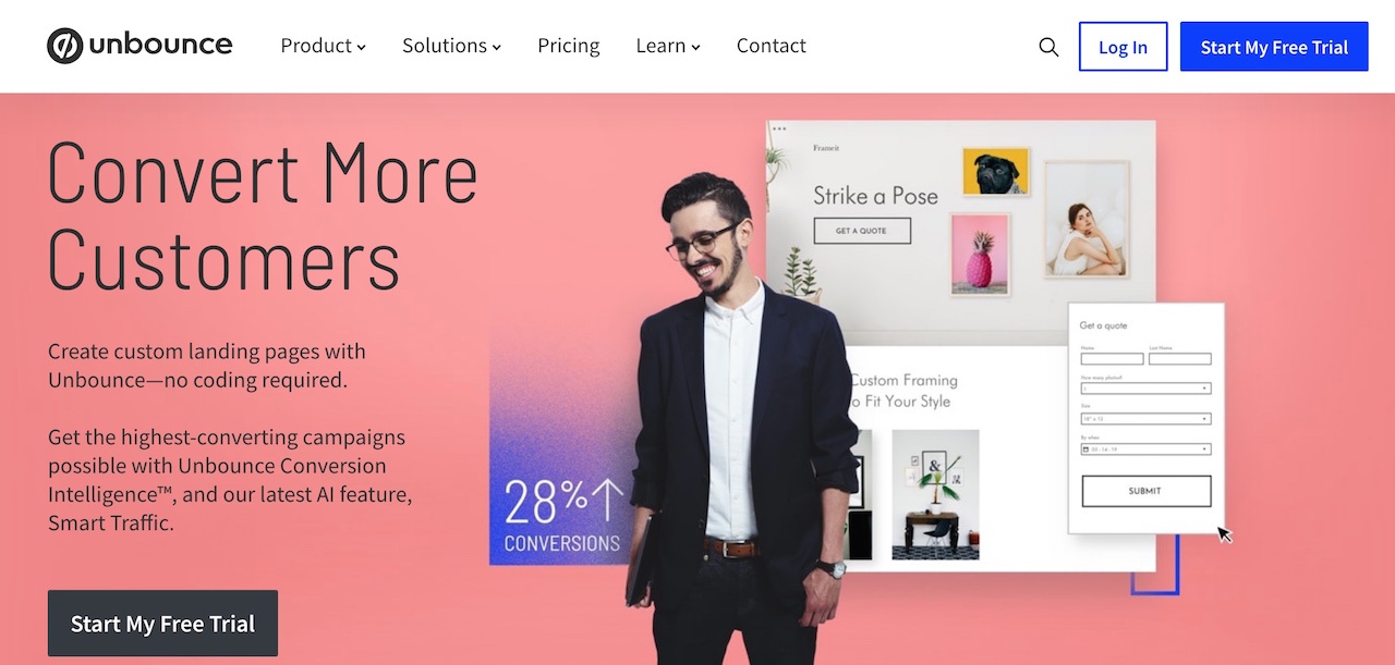
You land on their home page and this is where UX copywriting plays a critical part to get you to understand the page intuitively.
This time, the navigation bar is back!
The “Convert More Customers” tells you what the website is about.
And even the guy in the graphics is prompting you (with his line of vision) to stare at – and click on – the “Start My Free Trial” Call-To-Action button.
So this entire page manages to do the following:
- Give you a first impression of what Unbounce is
- Offer you options to explore the website
- Prompt you to take action if you’re ready
Not necessarily in a single glance, but done well enough for you to not need to over-think.
Major Platform #4: Blog Post
Let’s say you want to learn something, and found your way to a blog post.
Like this one from Contently.
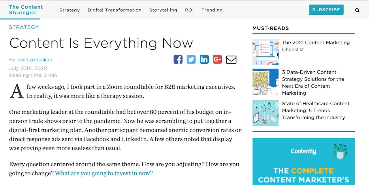
Perhaps after glancing at the headline, you’ll read the first few lines of the blog post and decide whether you want to read on.
You might also get distracted and glance at the other “MUST-READS” to see if there are other articles that might interest you.
In a split-second, you may weigh:
- Is this article interesting enough for me?
- Are the other articles more interesting, based on their headlines?
Which makes you either click away or continue scrolling on!
Or you may click on one of the above navigational bar items too, should you read the article half-way and find it boring.
What allow you to do all these effortlessly are:
- Clear, specific headlines of the article (and other articles)
- Lay-out of other articles at the side of the page
- Navigational bar
Which reduces your need to think and search for the next available content you might want to read or sections of the site you want to explore.
The 5 Guidelines for Crafting Effective UX Copy
If you’ve noticed a recurring theme in UX copywriting, it’s this:
Know where the user is in his/her journey, and guide them towards their goal.
To do so, here are 5 guidelines:
1) Be aware of what the user wants to do
Where is the user in his/her journey?
Understand why users arrived on your platform in the first place!
If it’s a home page, users may want to understand more about your website.
If it’s a landing page, users may be interested in what’s promised in your ad.
Knowing what users want allows you to craft suitable UX copy for them!
2) Allow users to understand at a glance
Save readers the effort of guessing.
At a glance, let readers know:
- What options are available (e.g. “Tour”, “About”, “Pricing”)
- What each option is about
So they can make split-second decisions!
3) Use clear, concise wordings
Don’t ramble.
Keep your wordings short and simple, so readers easily grasp what you say.
When one word suffices instead of two, stick to one!
4) Provide further explanations if necessary
For complex options, consider including sub-titles to explain each option further.
Sub-titles need not belong solely under article headlines. They can belong under navigation bar options too.
These can be grey-ed out or made smaller so readers read it only if they wish to.
5) Keep UX elements minimal
Keep the layout clean and simple.
Use white space whenever possible.
Like in landing pages, remove all unnecessary elements to keep users from getting distracted.
All these will help users navigate through your website or platform smoothly!
Explore More On Copywriting
Found UX copywriting interesting?
We got 8 more types of copywriting for you to explore!
Copywriting in general aims to drive action like sales or sign-ups. Learn more about how it can help your business with here.
Want even more?
Check out our 18 copywriting examples to get a better grasp of what copywriting looks like too.
